Have you ever wanted to delve further into the subject of colour theory and how to apply it to your urban sketches?
Colour theory is a huge topic, but I wanted to think about how it can be specifically applied for urban sketchers.
In this post will we look at the fundamentals of colour theory. We shall apply the theory to urban sketching and how we can master our use of colour choice every time we pick up our brush (or pencil or marker).
What if you could make sure you are using the correct colour combinations and understand why every time you go to add colour to your sketch?
I have been urban sketching for about 8 years without any formal art training. I had a minimal grasp of colour theory.
After putting my mind to it and engaging in lots of research, I finally understand why it’s important and how to apply it properly to my sketches.
This saves me so much time making colour decisions that my urban sketches are now quicker and more enjoyable to do. I’m more confident in knowing I can nail my sketch each time.
Most posts and discussions on the subject of colour theory are dense. It takes a lot of time to go through the information, as well as internalise and understand it. Although colour theory can be universally applied, many discussions are focussed on fine art, such as oil painting.
In this post, I will condense this information, simplify it and talk about theory specifically in relation to urban sketching.
I want to try to help you save you the time and research I went through and explain what I have learned in this one short post so you can increase your confidence in this area too.
What is Colour Theory and Where Did it Come From?
Colour theory can be considered the science of how we use colour. It explains how colour operates, why some things work, why some things don’t and why this is.
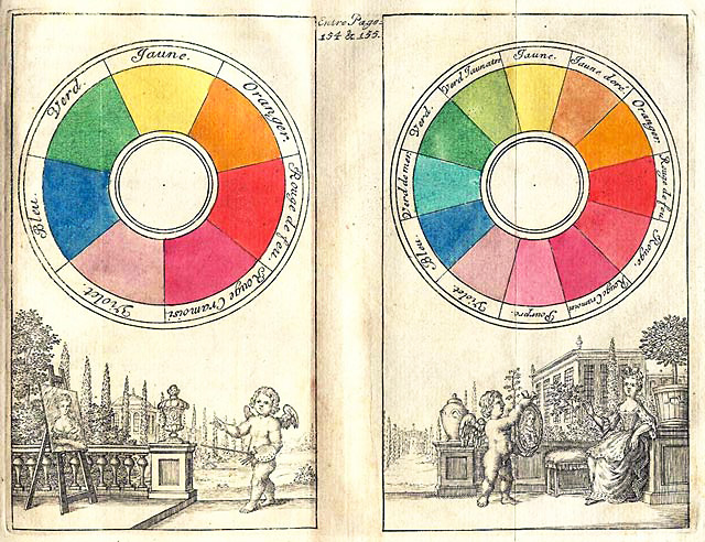
Colour theory was defined and formalised in the 1700s. Sir Isaac Newton found that all colours can be made from a mixture of red, blue and green light resulting in the first colour circle or wheel in 1666. However, it wasn’t until 1776 that scientist Moses Harris (following the work of a French painter) classified red, blue and yellow as the primary colours in regard to painting and created a corresponding colour wheel.
As hinted at above there are a few different colour systems:
- RGB (red, green, blue) is the system used for colours created by light
- CMYK (cyan, magenta, yellow and black) is the system used for printing
- RYB (red, yellow, blue) is the system used by artists for painting
We shall, therefore, stick to discussions based around the RYB (red, yellow, blue) system used for painting.
The Colour Wheel
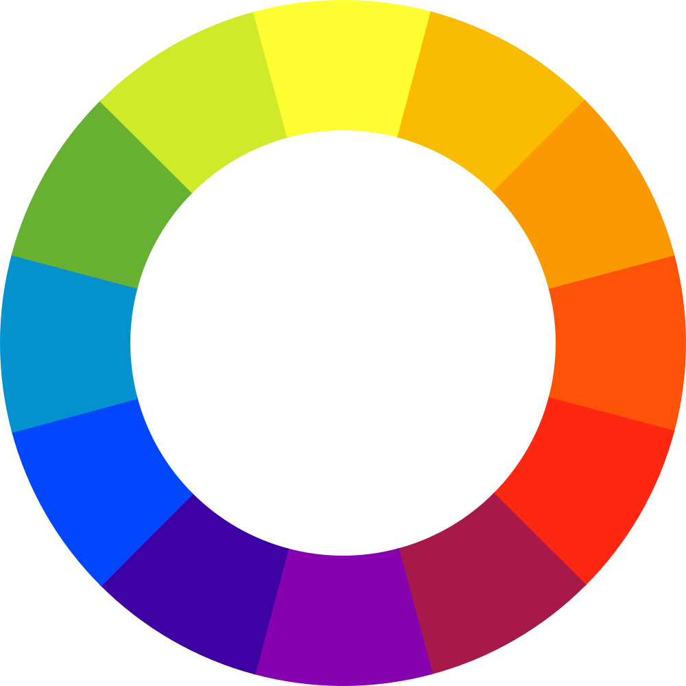
Above is the famous colour wheel which I am sure we have all seen many a time. We have to start from the basics though so bear with me.
Primary colours are the three colours that are the building blocks from which all other colours are made: red, yellow and blue. Primary colours are colours that cannot be made by mixing other colours.
Secondary colours are made by mixing two primary colours together: red and yellow make orange; yellow and blue make green, and blue and red make purple. The secondary colours sit in between the primary colours on the colour wheel.
Tertiary colours are made by mixing equal amounts of a primary and secondary colour together and fill in the gaps around the wheel between the primary and secondary colours as demonstrated by the colour star below. Magenta, Vermilion, Amber, Chartreuse, Teal and Violet are the six tertiary colours indicated below.

For an in-depth colour wheel, listing actual watercolour paint pigments and where they sit around the wheel, check out this incredible graphic by Bruce MacEvoy of handprint.com
(Disclaimer: this colour wheel is not for the faint-hearted!)
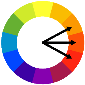
Complimentary Colours
Complimentary colours are colours that sit directly opposite each other on the colour wheel. Painting complementary colours side by side, or using them together in a painting will make them look bold and more vibrant. You can layer complementary colours to tone each other down. If you mix them they will make a strong brown or grey tone, which is fine if that’s what you are trying to achieve. However, avoid this if that’s not the colour you wish to achieve as you could end up with unintentional mud!
Analogous Colours
Analogous colours are three colours that sit next to each other on the colour wheel, such as red, red-orange and orange. They can work harmoniously together as they are from the same colour ‘family’.
Monochromatic
Using a monochromatic colour scheme means using various tints and shades of one hue. Don’t know what any of those words mean?? Read on…!
Colour Theory Terms
When discussing colour theory there are a few terms that are helpful to know the definition of (and can become easily muddled).
Hue – can be explained as “pure” colour, in the sense that no white, grey or black has been added to the colour to effect it. Black, white and grey are not hues (but they are still considered colours). Hues have a saturation of 100% while black, grey and white have a saturation of 0%.
Value – refers to the lightness or darkness of a colour. The term indicates how close to white or black a colour is. In the context of watercolour painting we do not use white to make a colour lighter (as artists may if they were painting with oil or acrylic), we add water.
Saturation – the term is used to definite the intensity and brilliance of a colour. It is measured in percentage. As mentioned above pure colour, or hues, have 100% saturation. If you decrease the saturation, colours become more washed out. You may have seen this effect when editing a photo on your smartphone or computer. If you boost the saturation level the image becomes brighter and more intense but if you reduce the saturation levels the colours in the image become faded and less vibrant.
Tint – refers to a hue with white added to it.
Tone – refers to a hue with neutral grey added to it.
Shade – refers to a hue with black added to it.
Want to learn travel sketching in ink & watercolour?
Check out my course, Sketch Your Adventures and for a limited time get 50% OFF!!!
Colour Temperature
The colour wheel can be split in half where one side contains warm colours and the other contains cold colours as per below:
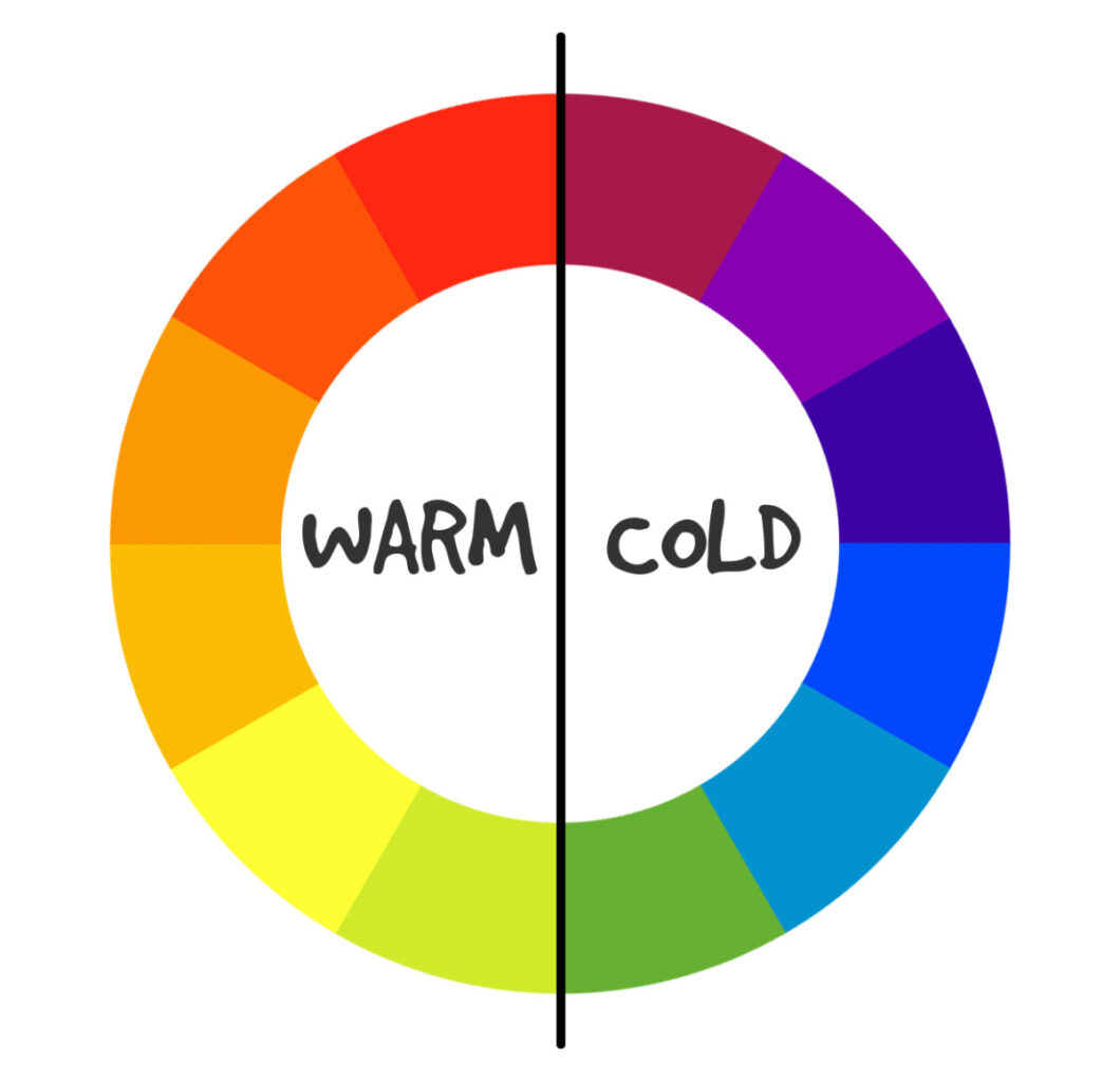
As you can see the wheel is cut in half between the reds and the greens. Warm colours and cold colours evoke a certain atmosphere. When used together they can create a sense of drama or balance and contrast, depending on how they are used.
The primary colours cannot be considered pure colours. All reds, blues and yellows have a slight temperature to them, they can be considered warm or cold too.
When looking at a colour such as red we can consider whether it’s a warm red or cold red. Is it a more orange-red (warm) or is more purple-red (cold)?
As such a system was developed called the ‘split primary system’ which is now a popular method for artists to select which colours they include in their palettes.
Check out my ebooks with hundreds of ink & watercolour travel sketches from all over the world. Get some inspiration for your next trip…
What is the Split Primary Colour System?
The split primary system refers to splitting the primary colours into two: a warm version and a cold version. As such on a palette we would have one warm red and one cold red, one warm blue and one cold blue and one warm yellow and one cold yellow – so 6 colours in total.
This system is useful because it allows for a wider range of colours to be mixed. As Jane Blundell explains, it’s difficult to get a full range of colour and be able to produce bright, mid and neutral secondaries from just one red, one blue and one yellow. This is why we need two different versions of each primary.
One of the leading books on the matter is ‘Blue and Yellow Don’t Make Green’ by Michael Wilcox (which you can find here on Amazon). Michael Wilcox changed the way we thinking about the standard red, blue, yellow primary system of colour mixing by introducing the split primary system.
In fact, you can see some extracts of a longer training course by Michael Wilcox himself explaining the system.
Part 1 is more to do with the history of painting, how paints were created and how this affected how colours were used historically. It’s interesting, however, Part 2 is where the real meat of this subject is and he really gets into explaining how the split primary system works and how you can use it to mix the right colour every time and avoid mixing muddy colours. It’s a tad science-y but he explains the theory clearly and it makes total sense.
Part 1
Part 2 << watch this one
In essence, what Michael Wilcox is saying is that when two colours are mixed they destroy each other and the impurities are what’s left. This is why some primaries mix well together and some do not.
The first practical way I introduced myself to this system is by purchasing the Essentials Set from Daniel Smith. I wanted to try out Daniel Smith paints any way (and at this time they only sold paint in tubes). The Essentials Set seemed like the perfect introduction as it contained warm and cold versions of each of the primaries.
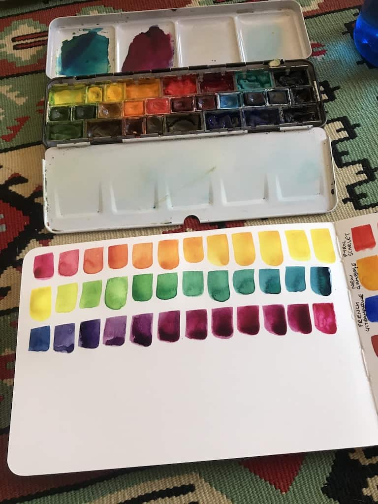
With this Daniel Smith Essentials set, I made a watercolour mixing chart.
This really helped me to understand:
(a) the range of colours that can be achieved from 6 primary colours
(b) how warm and cool primaries interact with each other
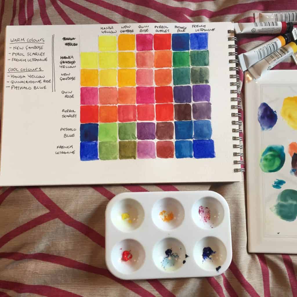
By making watercolour mixing charts for myself, I started to understand that to mix a vibrant secondary colour, you need to use the temperature of primary closest to it on the colour wheel e.g. to mix a vibrant orange, you need to use a warm red and a warm yellow.
To learn how to make your own watercolour mixing chart, check out my post here or check out my video below.
Practical Ways to Learn Colour Theory
Make your own colour wheel using your watercolour paints (or whichever medium you are using). This is the first step to learning the behaviours of your own colours.
As mentioned above, create a mixing chart from your colours. This chart will show you the range of colours you can achieve by mixing the colours in your palette.
This is great evidence that all you need are a few colours in order to achieve what you need. I currently have 14 colours in my paintbox but I think I could cut that down and still achieve the shades I need in my urban sketches.
If you don’t have the time to make a chart yet or you have some new colours you want to try, conduct smaller experiments: mix a warm red with cold blue, a cold red with a warm blue etc.
Keep notes in your sketchbook, use the first or last pages for your experiments so you can refer back to them when you are painting. I find this extremely useful.
The more you experiment with your own colours, the more you are going to understand how your paint behaves. It’s all very well reading the theory or watching videos but there is no substitute for actually making a colour wheel and mixing charts with your own paints for your own reference. It’s also actually pretty fun (I find)! Do these experiments in your sketchbook so you can refer back to them when you are on location.
For more information on how to make a colour mixing chart with your watercolour paints, check out my blog post here.
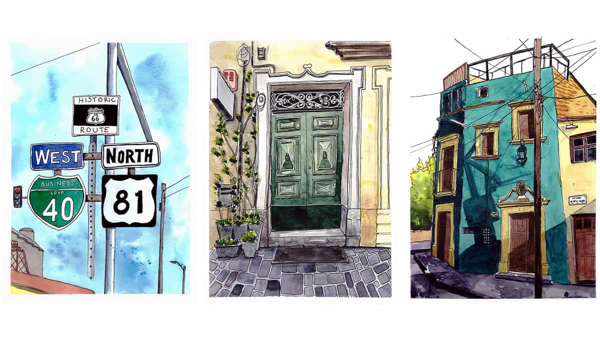
How to Apply Colour Theory to Urban Sketching
Speed is of the essence when you want to mix watercolours, especially if you are working wet in wet. The better you understand the theory of colours and how they work together, the quicker you can make decisions about which colours to use and which colours to mix in order to get the colour you need.
Choosing Colours For Your Palette
As mentioned earlier, a lot of artists base their colour choices on the split primary system, meaning they will include two versions of each primary colour: a warm and cold version of red, blue and yellow.
In addition to this, you may wish to consider selecting a green pigment for convenience, so you don’t have to constantly mix green. This saves a lot of hassle when you are trying to sketch quickly when you’re out and about, you don’t want to always have to spend time mixing the exact shade you need. You can also mix this green with other colours in your palette to get different shades.
I have one green in my palette, its St Petersburg White Nights pigment and is simply called ‘Green’ (725). In my other palette, I have Jacksons Art own brand Sap Green (which you can find here).
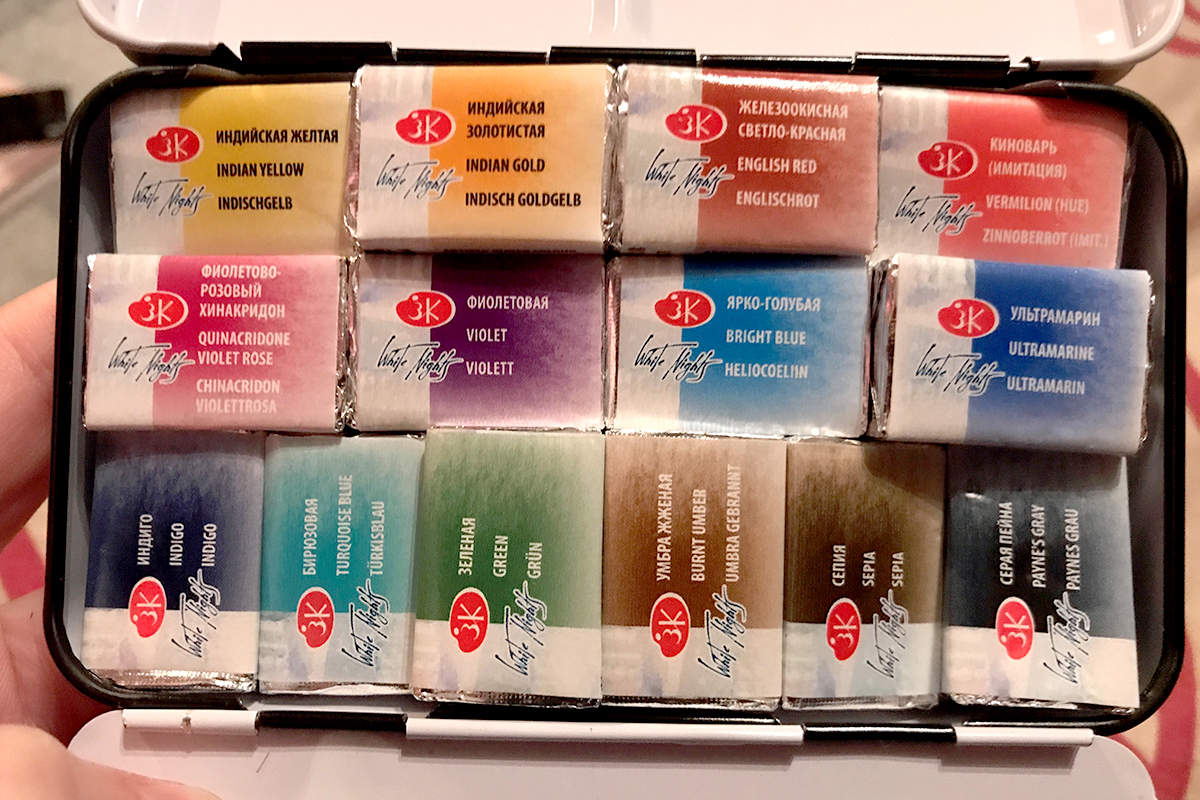
The same goes for a violet hue (if you feel it necessary). It’s not a colour I use much, to be honest, so I don’t feel it’s an essential colour to include.
Then it’s useful to have some earth tones (Burnt Umber or something similar is fairly essential I would say) as well as some darks, like Indigo or Paynes Gray.
Some of my favourite online classes
- Experimental Watercolour Techniques For Beginners – Ana Santos
- Watercolor Portrait Sketchbook – Carlos Rodriguez Casado
- Artistic Watercolour Techniques For Illustrating Birds – Sarah Stokes
- Urban Landscapes in Watercolor – Daniel Pito Campos
Psychology of Colour
As we learned when we kids, certain colours can evoke certain moods. There is much to be said about the psychology of colour and how it can affect how we perceive things. Just think of the common phrase “feeling blue”. Colours have a huge influence on us. We can use certain colours or colour schemes in our art to bring certain emotions to the forefront.
Warm colours can evoke feelings of joy and happiness, passion and excitement. Warm colours advance towards you from an image and draw you in.
Cold colours evoke feelings of calm and relaxation, they can also have a little sadness about them. Cool colours tend to recede into the background.
Using certain colour schemes can further enhance a certain sense of atmosphere. For example, using a monochromatic colour scheme in your painting could infer simplicity, purity or even starkness.
Mixing Darks
You will find most artists do not use a black pigment straight from the pan or tube as it appears flat and uninteresting. They would rather mix a dark colour using other hues in their palette. This makes the dark colour more dynamic and interesting.
A popular combination is Ultramarine and Burnt Umber in order to make a dark grey rather than using Paynes Gray or black pigment. The mixture of burnt umber and ultramarine is more interesting as in some areas you can see the pigments separate from each other, creating areas that are bluer and areas that are browner, making the overall effect more dimensional.
Experiment mixing different colours to create dark shades. From creating my watercolour mixing chart I can see that Violet and Paynes Gray make a beautiful dark purple and Turquoise Blue mixed with Sepia also creates a lush dark brown with hints of the turquoise peeking through.
Mixing Colours For Shadows
This leads us on to discuss mixing colours to use as shadows in your sketch.
I’m guilty of reaching for Payne’s Grey whenever I want to create a shadow.
Newsflash: shadows aren’t grey, shadows are full of colour too.
Experiment with creating shadows from other colours as mentioned above. Take into account reflective light too.
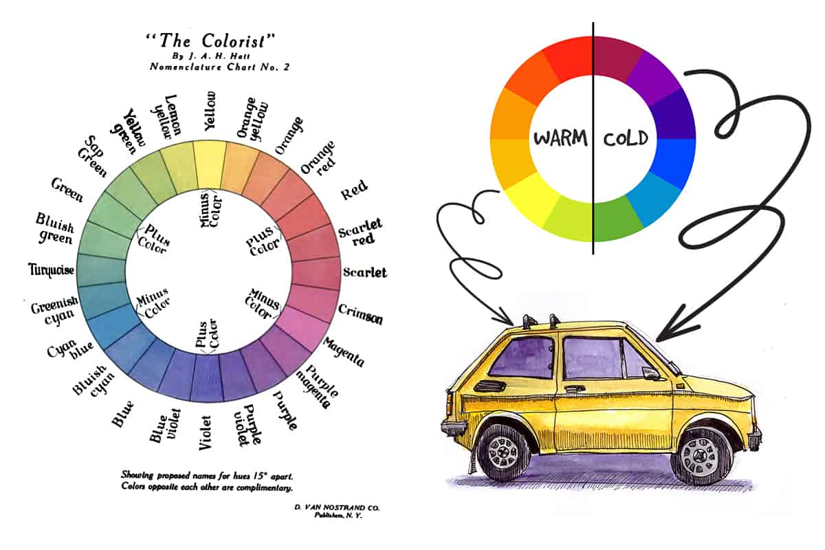
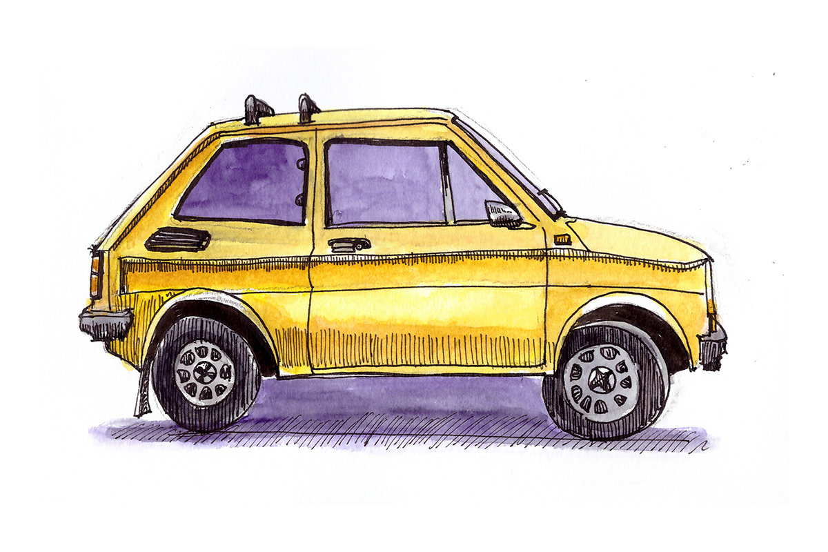
Using complementary colours as the base for shadows is a technique I have found works well. If I am painting a building that has a warm yellow hue to it, I find painting areas of shadow in a cool violet can be very striking.
Here’s a very basic example of this idea in a quick car sketch I did:
Final Thoughts
This was a bit of a crash course through the basics of colour theory, how it relates to us as urban sketchers and watercolour artists and practical ways to practice the concepts and apply them in our daily sketching habits.
I hope this helps. Make sure to check out the post and video on how to make a watercolour mixing chart. If you do only one thing to advance your knowledge of colour and colour mixing, make a colour mixing chart!