Following on from my post about different urban sketching styles and how to achieve them I thought we should delve deeper into how I found my own style which in turn may help you to go about finding your own urban sketching style.
After a number of years, I think I may have found and started to settle into a style.
How do I know this?
Because now I sketch and I don’t think about how I am going to do it or what I’m doing, it just comes out naturally. Looking at sketches side by side, they seem distinctive and unique to me. Therefore, I think, my sketches are consistently ending up in a specific style. This is not to say I won’t stop experimenting but I think I am finally getting to a point where I am developing my own signature.
How I Found my Urban Sketching Style
There’s something particular I was doing that helped me find my style, or helped me realise that I may have a certain style now.
I decided to do a series of sketches.
I think doing a series of sketches linked to each other and sketched in a short succession can really help bring your style into focus. I decided to focus on the big landmarks of London. I originate from just outside of UK and I’ve never actually sketched some of the city’s most famous sights.
At the time of writing, we are in the middle of a global pandemic and as such in lockdown. Therefore I sketched from photos I found on the internet – so this is a virtual urban sketching experience. Hopefully, we can get back to sketching outside soon but for now, we have to make do with what we can do.
Sketching from photos is no less fun and perhaps even allows for more experimentation as there’s less time pressure or environmental factors to take into account. There’s more time to practice and play. We have access to more of our art supplies than what we could carry with us (this can be a good thing or a bad thing!) and finally, when we are let out we will have improved our sketching skills…or even have found our own unique style in this time spent at home!
Sketch #1 – Natural History Museum
London has some incredibly beautiful architecture. Museums are usually housed within very old decorative buildings. I came across a great photo using a fisheye perspective of the Natural History Museum.
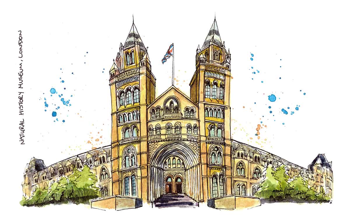
This was an interesting exercise in sketching a different type of perspective than I’m used to. I thought about how to focus the eye on the key details at the centre of the sketch. As I got the further out from the centre I drew fewer details and tailed off.
With this first sketch, I struggled with the colours. The building in the photo was a very flat stone colour and I knew I wanted to do something a bit more interesting. In the end, I just added contrast wherever I could, such as painting the windows a light blue colour to counter the yellow of the building.
Splashes of green for the trees helped to add some interest, as well as a few splatters of blue and orange in the sky area. This was the first sketch of the series and I think you can start to see a bit of a progression as I move on to the second sketch – Westminster Abbey.
Do you want to learn how to sketch your own adventures in ink & watercolour?
GET 50% OFF FOR A LIMITED TIME ONLY!!
I will show you my exact sketching process in ink and watercolour. I have travelled around the world in the last 3 years and this is my go-to system of creating beautiful yet quirky illustrations to capture the magic of my discoveries.
We will work through 3 projects, step by step (pictured below), all of which are real-life examples of things I have sketched along my travels. I provide the photo references you can work from.
We will start by choosing a composition, laying in the initial pencil sketch, adding ink lines, layering watercolour and adding the final touches.
This and much more are included in my course, Sketch Your Adventures, click the button under the image to find out more!
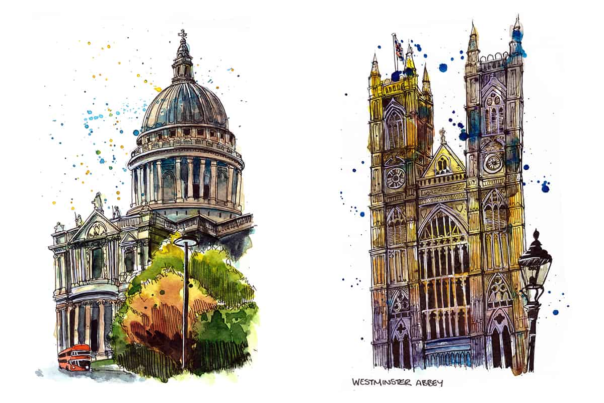
Sketch #2 – Westminster Abbey
For sketch number two I decided to draw Westminster Abbey. I just love sketching gothic architecture. It’s so fun to draw, especially since I figured out that I can make sketches of such buildings look so complicated even though I’m representing heavy ornamentations with simplified lines and shapes.
Once you step back from the sketch it looks really intricate. Look closely though and you just see some well-place squiggles. Once you get the hang of it, I’m sure you will love the challenge of this type of architecture too – it’s addictive.
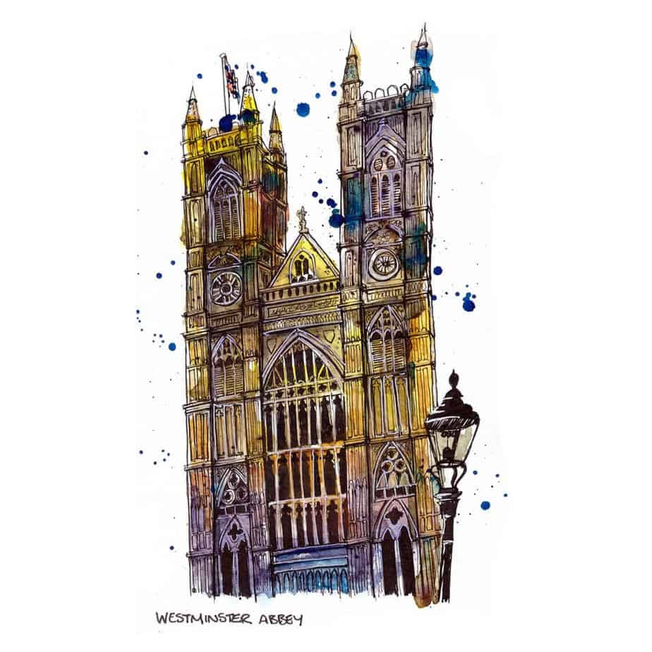
As you can see I went a bit wild with the colours. I accidentally channelled Ian Fennelly in this sketch. This was absolutely unintentional.
The issue I had with the sketch when it was done was that it was just so dark. I was too heavy-handed with the dark blues and purples and had not left enough light areas.
I managed to rescue it slightly by using a white gel pen. I went around some of the windows with it and I think it brought a bit of relief to the sketch as a whole.
I like the jaunty angle of the building and I think adding the lamp post in the foreground in a solid black gave the sketch some added interest. I definitely learned a lot from this sketch. I do really love the colours. I intentionally decided to go in very bold and just work wet in wet with different colours and let them blend on the page. It helped to loosen up.
Sketch #3 – St. Paul’s Cathedral
For the third sketch in my London landmark series, I decided to sketch St. Paul’s Cathedral.
I tried to loosen up a bit and not worry too much about lines being parallel or straight. I tried to focus on being quicker and looser.
I think the addition of the London bus, the trees and the lamp post in the foreground added a bit more energy to the scene. There would have been a time where I would have left that stuff out and just focus on the building, partly because I just wanted to capture purely the building and partly because I didn’t have the confidence to add in extra features (or ‘street furniture’) for fear of ruining the sketch. I didn’t think I could sketch these items well enough to compliment the building.
I’m starting to loosen up a bit now and just go for it. Telling a story through the sketch is much more interesting than just trying to make a pretty drawing of one thing.

I tried to learn from my mistakes with Westminster Abbey and avoid being too heavy-handed with the dark colours, ensuring I preserved the lighter areas.
Hitting the lightest lights and darkest darks to give maximum contrast has really been the key for me to achieve the impact I want from my sketches. It seems an easy enough concept writing it here but when you are in the thick of a sketch it’s easy to forget or lose sight of this, especially when it comes to the lights. Obviously you can make darks darker but you can’t really rescue the lights once they’re gone. There are things you can do if desperate but otherwise, you just have to let it go.
Interestingly my sketch of St Paul’s Cathedral is by far the most popular sketch I have posted on my Instagram feed. Not that number of likes means anything at all. But it is something I have noticed and wondered “why”? What is it about that sketch that’s really captured the attention of people who follow me or see my work. Of course, there are always a number of factors to do with such things, such as the hashtags you use, the time of day you post, the day of the week, maybe even the time of year!! Who knows.
Sketch #4 – Tower Bridge
The fourth in the series was Tower Bridge. It had to be done. I started mapping out the big shapes and key features in pencil across a double-page spread in my landscape A5 Moleskine watercolour sketchbook when fear took hold.
I’m sure we all do this, I just could not help judging the sketch at the very early stage as terrible. I genuinely almost gave up, thinking “no, I can’t do this, its too complicated, it’s going to be rubbish”. Does anyone else talk to themselves this way when they start a sketch?!
This was clearly the stage of self-doubt. The author Steven Pressfield calls this “resistance”. You start to think you’re rubbish, question why you are even doing something like this, start talking yourself out of doing anything further because clearly you are just an imposter and you don’t know what you’re doing.
I had to talk myself off the ledge. So what if it’s rubbish? It’s my sketchbook. I’m allowed to be as rubbish as I want!
In actual fact, it was my boyfriend who was the one that actually gave me the confidence to move forward. He said, “just go for it, go crazy with it, see what happens”. He thinks my best sketches are the ones where I don’t try to be neat or overthink it or labour over the details. And wow, did he help me move forward with this one.
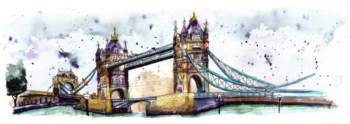
The sketch came out better than I could have imagined. I did exactly as he said, let go and just went for it. I was very happy with the results. Sketching over a double page it so much fun, the final sketch has so much impact because of the size and orientation. I recommend giving it a go!
Something I enjoyed about this sketch was creating a focus or point of emphasis, which was the first tower. I faded the bridge out in the foreground. I think this is the first time I have tried such a technique. I liked the perspective of the scene.
The other thing I tried for the first time was wetting the paper to paint the sky and then dabbing some of the paint away with a paper towel to create cloud-like effects. I have seen this being demonstrated in YouTube videos or courses before but I had never actually tried it myself. I was super happy with the effect.
Something I continued throughout the last few sketches was the use of warm light shades (the yellows/oranges of the building) and using a complementary cool colour for the darker areas, such as shadows. I have not been focussing on realistic colours at all. This has helped loosen up my painting and its something I can see has developed, unintentionally, throughout the series.
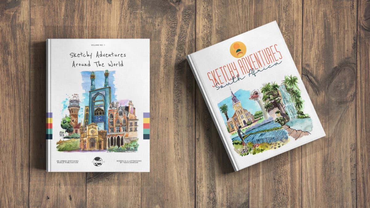
Check out my ebooks with hundreds of ink & watercolour travel sketches from all over the world. Get some inspiration for your next trip…
Sketch #5 – Big Ben
I concluded my series of sketches with Big Ben. I enjoyed the impact of sketching across two pages in landscape orientation when sketching Tower Bridge, I wanted to do the same but in portrait orientation. Therefore, the obvious choice was Big Ben.
I knew I was going to exaggerate the proportions of the tower compared with the rest of the building from the start so I could make the most of the space across the pages.
I wanted to paint a dramatic sky again. The photo I was working from was actually taken at night, so the sky was super dark and Big Ben was illuminated. The rear lights of the busses were reflected in the road surface and they offered a beautiful perspective as they lined up into the distance. The people on the pavement on the right also offered an interesting element to balance out the sketch.
I’m still nervous to add people into my sketch but as they were walking away, with their back to the viewer and it was dark, this was the perfect opportunity to add simple human shapes in without being overwhelmed with any details.
By the time of this final sketch, I was so much more confident it was unreal. I sketched quicker, used fewer pencil lines, did not agonise over the details I drew in pen and splashed the paint on knowing that it never looks great at first but you need to keep working on it, building the layers until achieving the right level of contrast. I felt a real transformation in terms of confidence.
How To Find Your Urban Sketching Style
If you are at the point where you really want focus on building a style I hugely recommend sketching a series. I think five sketches is a great number as you find your feet in the first two and then start noticing some common elements in sketch 3, you can start to emphasise those elements in sketch 4 and by sketch 5 it all comes together into a confident finale!
I fully intend on continuing doing more series of five sketches. I may move to a different city. Someone suggested using ‘castles’ as a theme, I love that idea.
If you sketch a series, let me know how it goes, you can tag me on Instagram (@urbansketchingworld) or email me to discuss your findings, I always reply! taria@urbansketchingworld.com
Some of my favourite online classes
- Sketching People with Watercolour – Marcus Penna
- The Art of Sketching: Transform Your Doodles into Art – Mattias Adolfsson
- Daily Sketching for Creative Inspiration – Sorie Kim
- Illustrating Nature: A Creative Exploration – Laura McKendry