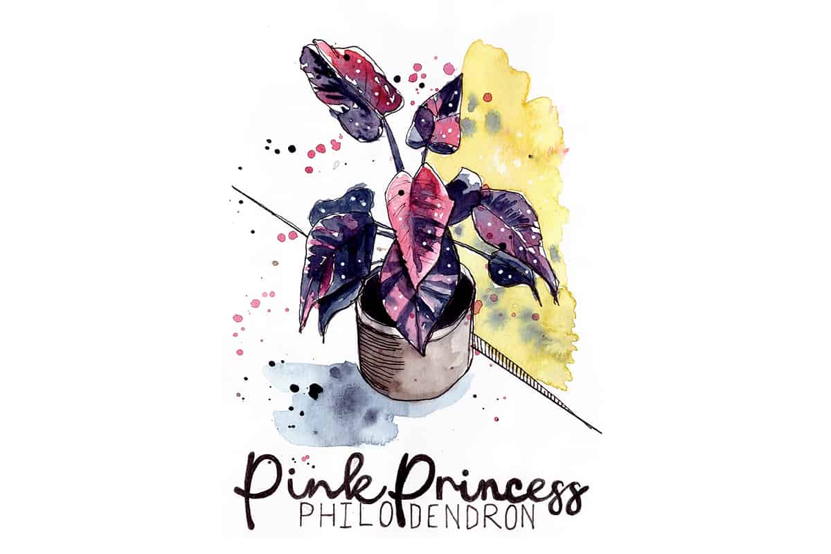
Have you seen those perfectly composed nature or travel journal layouts on Pinterest? You know, the ones that have beautifully perfect illustrations and gorgeous hand-lettered script next to them?
Well, not all journal or sketchbook pages need to look that way. Mine most certainly do not. But if you’re excited about keeping a journal-style sketchbook, recording your travels or any other subject then learning some basic hand lettering techniques is a sure-fire way to add that elusive flair to a page.
You may think you have “doctor’s handwriting” (i.e. illegible) but forget handwriting. Hand lettering is an art form in itself. If you change your mindset and think about drawing letters rather than writing them, half the mental battle has been won.
Why Add Hand Lettering to a Sketch?
You don’t need to add any special hand lettering to a sketch but since you’re here reading this, I’m going to assume you are interested in this topic.
Here are some of the reasons you may want to add some hand lettering to your sketch.
- Adding hand lettering can really ‘finish’ a sketch off
- Record location and date of the sketch
- Record other meta-data, like time, the weather
- Add notes to aid memory of the scene
- Add technical notes about your sketch such as colours/mixes used etc.
- Give your sketchbook an overall ‘journal’ feel
If you’d like more information on how to design a dynamic sketchbook spread, check out my post here.
A Brief Overview of Hand Lettering Styles
Without going too over the top let’s just have a brief look at the various different types of lettering:
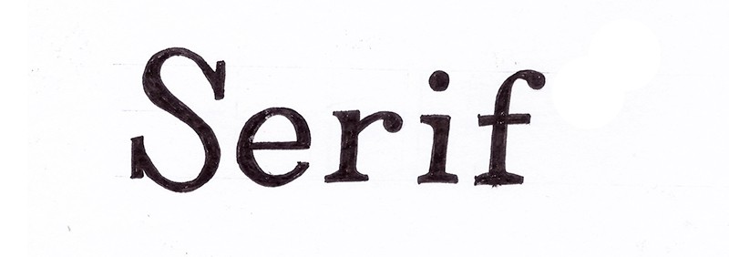
- Serif
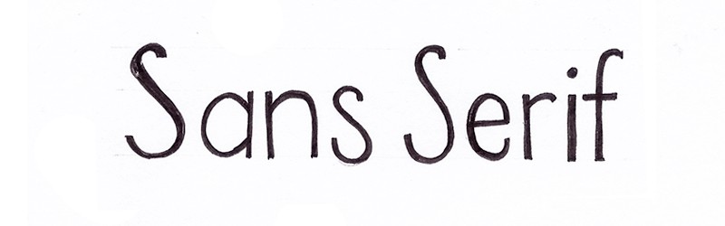
- Sans serif
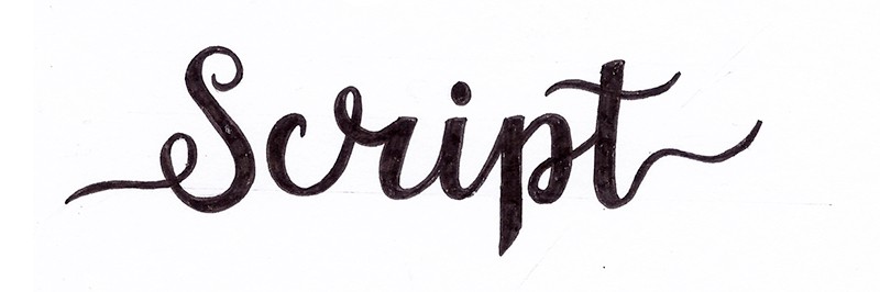
- Script
Serif letters are those that have little ledges at the end of a main vertical or horizontal line that makes up the shape of the letter. A common serif font that you may have used over the years is ‘Times New Roman’.
Sans Serif fonts are those that do not have the little ledges. Fonts used on screens are mostly sans serifs. I believe this is because sans-serif fonts are just easier to read digitally. Conversely, serif fonts are a little easier to read in print. I think a vast number of books, at least traditionally published ones, will be written and printed in a serif font.
Brush lettering or ‘faux’ brush lettering has become super popular in the last few years. This type of letting would fall into the broad category of ‘script’, which tends to be a more decorative flowing style of lettering.
There are thousands of books, videos, courses on lettering. There is so much that can be said as the entire subject is an art in itself. However, for the purpose of us urban sketchers who just want to learn how to create some beautiful letters to add to our sketches now and again, let’s keep things simple.
Want to learn travel sketching in ink & watercolour?
Check out my course, Sketch Your Adventures and for a limited time get 50% OFF!!!
Where to Get Ideas for Hand Lettering Styles
Books About Hand Lettering
There are an enormous amount of books about hand lettering on the market. Hand lettering exploded in popularity a few years back and while I think the level of interest has dupped, it’s still a popular subject amongst crafters, journalers and sketchers alike.
I have many hand lettering books at home, including some very expensive ones about graffiti tags and “hand styles”. I love that stuff so much, however, I digress. Below are a few suggestions for books about hand lettering. I have found a few of them cross over heavily and some are the exact same book with a different cover (which I found out to my annoyance a couple of times).
To be clear, I don’t really think you need to buy a book on the subject but if you’re like me and you love books with gorgeous colourful illustrations and like having something tangible close by to open up and refer to then, buy a book. But just daying, not really needed.
The Big Awesome Book of Hand & Chalk Lettering – Dina Rodriguez
I’m a big fan of Dina’s work and have followed her on Instagram for many years, she also has a fantastic podcast called Women of Illustration which is excellent and highly worth checking out.
The Art of Whimsical Lettering – Joanne Sharpe
I like this book as it’s quite different from other hand lettering books on the market, which can get a bit samey (or even identical, as mentioned above). Joanne Sharpe approaches the subject through the lens of art journaling which I think applies to us as sketchbook artists a little more. We are not looking to produce hand lettering as a piece of art in itself but to add lettering to our existing artwork. That’s why I think this book is probably one of my favourites.
Lettering Alphabets & Artwork: Inspiring Ideas & Techniques for 60 Hand-Lettering Styles – Jay Roeder
This book is more inspirational with beautiful full-colour illustrations. Certainly aimed at producing lettering as works of art in themselves but the range of different lettering styles and how they’re present is gorgeous and thought-provoking. There are just so many different styles of letters. I think the author does a good job of both teaching the basics and providing inspiration for advanced abilities too.
Hand Lettering Inspiration on Pinterest
If you don’t feel like forking out for a book, Pinterest is a diamond mine of inspiration. Pinterest was built for such interests as hand lettering and I’m sure you can lose yourself for a solid amount of hours perusing jaw-dropping work.
There is a danger though, you can become overwhelmed and lose sight of the objective of adding some interesting lettering. So before you fall into a wormhole of low self-esteem, thinking you can never achieve such perfection just remember to use the platform for inspiration and don’t get lost in the thoughts of trying to emulate this stuff.
We are urban sketchers. We are sketchbook artists. We are not professional hand letterers like some of these people are.
For somewhere to start, feel free to follow my lettering board over on Pinterest.
Hand Lettering Inspiration on Instagram
Again, there is a wealth of inspiration on Instagram when it comes to hand lettering. Some of my favourite Instagram accounts for hand lettering inspiration are:
https://www.instagram.com/lettering_daily/
https://www.instagram.com/pezandpencil/
https://www.instagram.com/stefankunz/
The same advice applies to Instagram as it does for Pinterest. It’s easy to lose yourself in the incredible work out there and then fall into thinking “I can’t do this”. Keep your perspective.
Font Websites
Websites that display different fonts to buy (or in some cases download for free, usually for personal use only) are an excellent resource to use to practice letters.
Dafont.com is one of my favourites as you can write the word you want in the box and it will show you how it looks in the font you’ve chosen. I set the size to large and then I can draw the word or words from there.
Font Squirrel is also a great place to look at fonts as well as Google Fonts.
You can browse through various different categories of font, depending on what sort of vibe you want. For example, Dafont.com has categories such as gothic, old school, Mexican, through to fonts that look like runes! Check out my youtube channel to see which font I chose and how I sketched it out.
How to Practice Hand Lettering
To practice hand lettering at first and to at least get the hang of a few different styles, I recommend using paper with square gridlines on (like the paper you used to use in maths class at school!) or at least take a ruler and draw some guidelines for yourself.
You need to draw a baseline, a line where the top of your tallest letters will reach and then also a line somewhere between these two lines where your smaller letters will touch. There are technical terms for all of the things I am mentioning but I feel there’s no real need to complicate things in this post. Using guidelines is the one major thing that will help you to draw letters more consistently and neatly. I know, because I never used to draw the guidelines but now I do, my lettering is instantly better.
Then find some fonts that you like from one of the resources we’ve mentioned. My favourite website to browse for font ideas is dafont.com.
From there just practice drawing the letters in pencil, paying attention to where the letters reach the top line and the bottom line.
Also, pay attention to the gaps in between your letters, try to get them as even as possible. I found a font called First Order and for some reason, the city of Edinburgh is on my brain so I decided to draw this word in the font.

To make life easier I decided to add some guidelines to the word in Photoshop, this made it so much easier to see where the letter sat on the lines. You could print the word out and draw lines with a ruler if that seems easier.
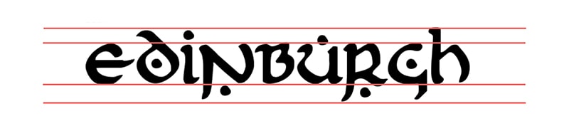
I didn’t quite get the proportion of the lines on my piece of paper quite right, I drew them before even thinking about adding them on in Photoshop to make it easier to see. But the idea here is to practice drawing letters rather than producing a carbon copy.
In my opinion, hand lettering should have some inconsistencies here and there as it shows it was done by a human and I think makes it more beautiful.
If you want to watch me draw this word in this style of letting, check out my video below:
Examples of Hand Lettering in Sketchbooks
Dates
I really like how Gaye Kraeger shows how she adds dates to her sketches in this video sponsored by Strathmore. I have started to implement this format of displaying the date in my own work from time to time (when I remember) and I always feel it looks so much better than just writing the date in a linear fashion hidden away in the corner.
Check out the video below to see a few of her suggestions.
As well as presenting how she adds dates to her sketchbook, Gaye has a particularly great tip in the video: print out some fonts you like at the same size as your sketchbook and keep it tucked inside so any time you want to add some nice lettering you have a bunch of different fonts to reference. Genius!
Liz Steel uses rubber stamps to record the date in her daily sketching journal which I think looks fabulous. She tends to print the first two letters of the day of the week followed by the number of the day and then the month, i.e. MO0607 for Monday 6th July.
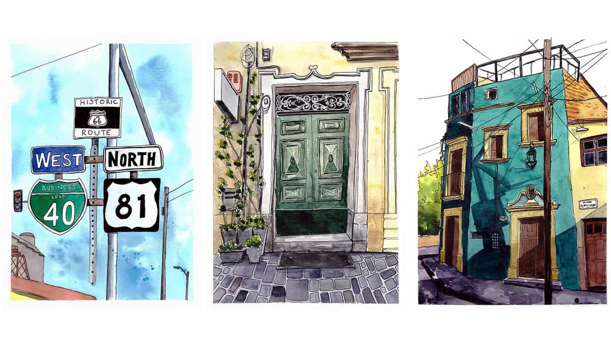
Check out my ebooks with hundreds of ink & watercolour travel sketches from all over the world. Get some inspiration for your next trip…
Words/Titles
Below I want to show you some examples of hand lettering in sketchbooks from some of my favourite urban sketchers.
Pat Southern Pearce
Pat tends to sketch on toned paper alot and has a very distinctive lettering style. In fact, in her workshops, lettering is one of the topics she teaches.
Liz Ackerley
Liz also has a very distinctive way of lettering. So many of her sketches feature this style of lettering, to the point that when I see one of her sketches, I immediately know it’s by her!
Alicia Aradilla
Alicia has gorgeous loopy script-like handwriting that she does in her sketchbook. I can’t read it but it looks beautiful!
Some of my favourite online classes
- The Art of Sketching: Transform Your Doodles into Art – Mattias Adolfsson
- Intro to Portrait Sketching: Draw in Real-Time – Bill Robles
- Daily Sketching for Creative Inspiration – Sorie Kim
- Urban Sketching: Create Expressive Cityscapes – Eleanor Doughty
James Richards
Jim is or was some kind of urban planner therefore he has classic architects’ handwriting (I think) and it looks great. I wish I could pull off his style of writing…I need to practice!
Santi Salles
Check out how much impact is added when Santi writes some notes to the side of his illustration of the Corona bottle. Personally, I just think it takes the sketch to another level.
He is not doing anything overly ornate, he is just using his own handwriting, he even scribbles out a little mistake. I love how organic and honest Santi’s style is. Including his little colour swatches to the left of his illustration.
Proof that you do not need to be an expert hand letterer, or even neat (!), to add lettering to your sketchbook and still have it look amazing.
Final Thoughts
I hope this post has given you a lot of value in terms of inspiration as well as practical advice to put into action.
If you would like to see more from me, please check out my Youtube channel. If you would like to hear from me once or twice a month, then please do join my sketchy newsletter! I’ll send you occasional golden nuggets of urban sketching-related goodness right to your inbox PLUS a free ink & watercolour class!