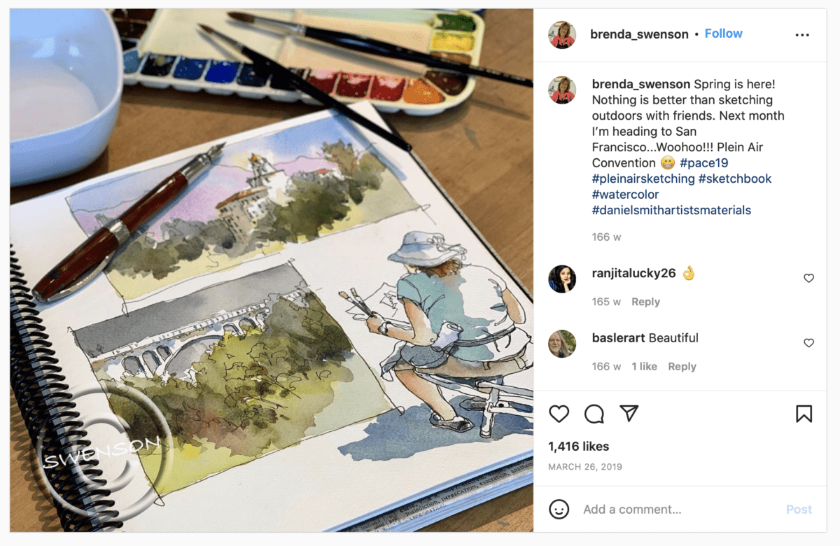
What is a Sketchbook Spread?
Urban sketchers use their sketchbooks in various ways. Some sketchers like to do a big sketch per page of their book. I think I fall into this camp 90% of the time. However, some sketchers create a series of sketches on one page, or across a double page. This creates a sense of fun, it’s like a collage, the sketches can tell a story or a give an overall impression of a place. The sketches could run in a linear timeline, offering a narrative of a day. Or perhaps they are a collection of sketches of the same or similar items that the artist has come back to over time and added more and more to.
Why Create a Sketchbook Spread?
First of all, this is not something you need to do. This is just a suggestion of how to use your sketchbook in a creative way. The sketchbook is a unique format. It can be used to record ideas, as a playground to explore different mediums or techniques, as a means to practice and as a place to exercise.
More often a sketchbook is almost becoming a handheld gallery. With more and more of us offering up our sketchbooks to be flipped through physically by family and friends but also virtually by millions of strangers. I have a few of my own sketchbooks you can look through on my Youtube channel, such as the one below.
Sketchbook spreads can be a fun way to tell a story using sketches over time, such as the course of a day or a week for example. Collecting sketches of the same or similar items also creates its own compelling story, telling us as the viewer (if you choose to share your sketchbook) what you find interesting and visually appealing.
A sketchbook spread containing a series of sketches can communicate a narrative. Experimenting with spreads can also help build your compositional and layout skills. Learning how to connect disparate sketches and place them in a visually pleasing way across a page is an important design skill that’s worthy of practice in its own right.
Do you want to learn how to sketch your own adventures in ink & watercolour?
GET 50% OFF FOR A LIMITED TIME ONLY!!
I will show you my exact sketching process in ink and watercolour. I have travelled around the world in the last 3 years and this is my go-to system of creating beautiful yet quirky illustrations to capture the magic of my discoveries.
We will work through 3 projects, step by step (pictured below), all of which are real-life examples of things I have sketched along my travels. I provide the photo references you can work from.
We will start by choosing a composition, laying in the initial pencil sketch, adding ink lines, layering watercolour and adding the final touches.
This and much more are included in my course, Sketch Your Adventures, click the button under the image to find out more!
Storytelling
There are many ways to tell a story with your sketches, here are a few ideas from other urban sketchers as well as myself.
Create A Collection of Items
Marc Taro Holmes mentions this in his Travel Sketching in Mixed Media course on Bluprint. You may find pleasure in sketching certain things and over time you may build a collection of these items. It looks great to have this collection on one sketchbook spread. You can start the spread and come back to it over time as you come across new items to add to your collection. It does not always have to be the same item many times over, it could also be a collection of items that fit a certain theme.
Urban sketcher, Pete Scully, collects sketches of fire hydrants as he comes across them.
Here are a few more gorgeous examples from urban sketcher, Santi Salles. Tiny houses, condiments and Polaroid cameras.
Travelogue / Travel Journal
This is very much a type of spread I am used to creating. Sometimes I will make a collage of scenes or angles of one place such as the spread below of Persepolis in Iran which runs across a double page of a landscape-format Moleskine watercolor album.
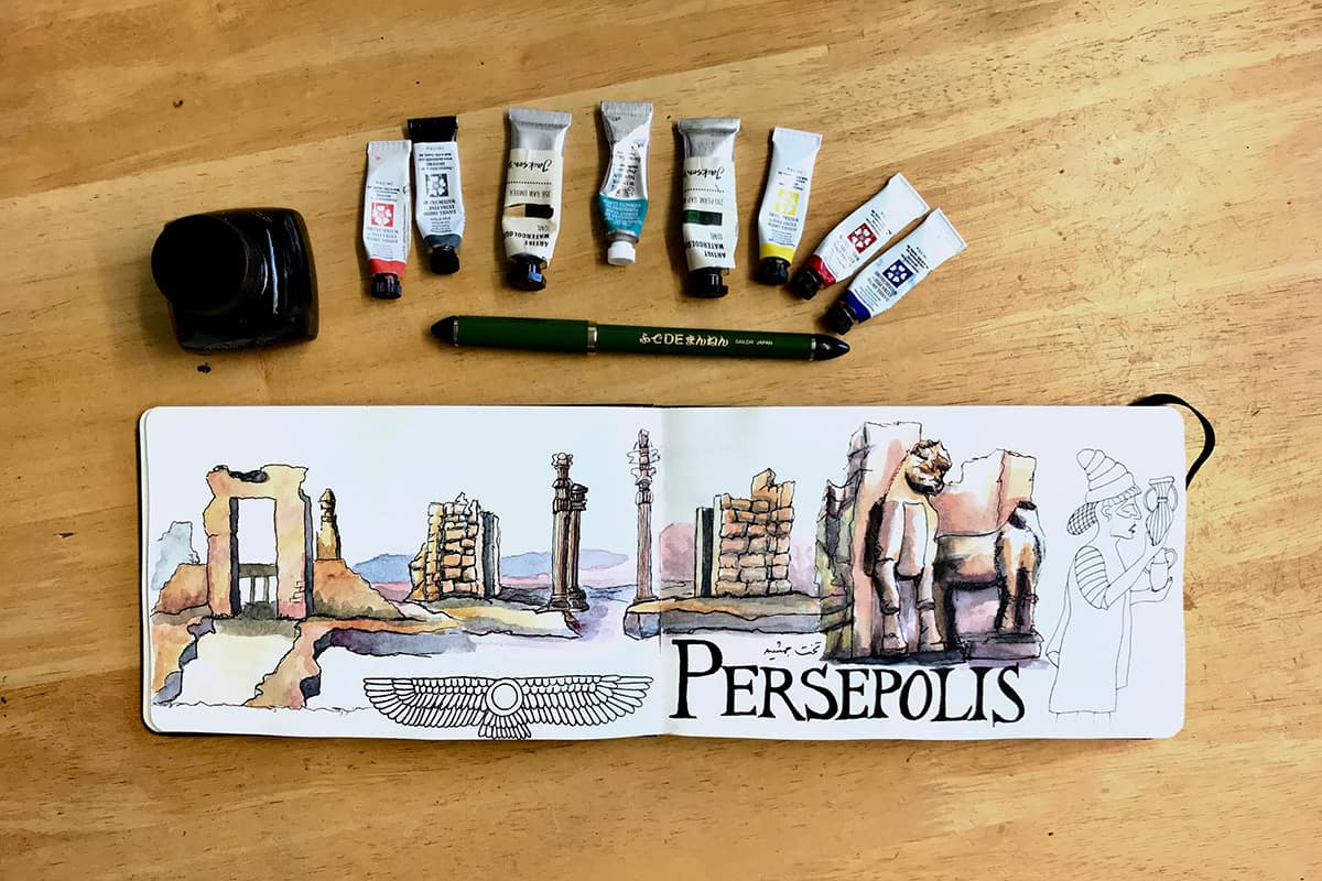
In fact, I used this method for a few of the cities in Iran I visited, it was super fun to make a series of little sketches to give an overall impression of the place. This is also useful if you are short on time and travelling with other people.
Need some inspiration on adding lettering to your sketches? Check out my FREE class!

Graphic Novel/Comic Book
Split your sketchbook spread into boxes and fill each box with a different element of the scene you’re sketching. Miguel Herranz demonstrates this in Sketchbook Skool’s Urban Sketching Course.
I love the idea because it helps to make a scene less overwhelming, capturing just the parts that interest you, such as the way a roof slants, a decorative street lamp or some curious pigeons.
You could take this a step further than just using the layout device of a comic book and include snippets of conversations you hear or thoughts you’re having while sketching or about your sketch. I love sketches that include annotations or notes within them.
Deconstruction
You could draw a deconstruction of an item, close-up sketches of certain angles, sketch the various parts, and how something works or fits together, almost like a manual or scientific illustration.
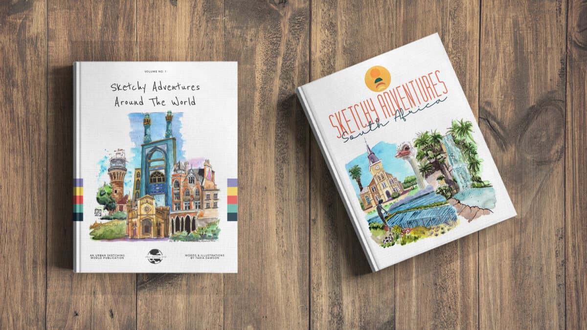
Check out my ebooks with hundreds of ink & watercolour travel sketches from all over the world. Get some inspiration for your next trip…
Timeline
Another way to create a spread is by documenting a certain building, location or project over time. Perhaps you live in a city where the skyline is ever-changing, things are constantly being built and torn down. You could keep a record of this evolution by keeping the spread available to go back and add to over a period of time.
If you would like more information on the art supplies I use and recommend, head over to my Recommended Stuff page. In addition to art supplies I share my favourite books and courses too!
How to Layout a Sketchbook Spread
There are some well-established design principles when it comes to layout. I was made aware of these elements from my own minimal design education (a short course in Graphic Design at Central St Martins in London). These elements are universal across the visual arts and as such can be useful things to think about when creating your sketchbook spread – especially if you are trying to make it dynamic.
Composition
When composing a sketchbook spread it is always important to keep composition in mind. There are certain rules you can follow to help with this, such as the rule of thirds.
Other factors to bear in mind are elements such as scale, repetition, symmetry and colour as ways to create visual harmony in your layout.
Rule of Thirds
The Rule of Thirds concept is as old as the hills…ok, not quite, more like 1797. The rule of thirds is used across all visual arts, such as photography, film and design, to create a harmonious and visually pleasing image.
You will most likely find a setting on your smartphone that allows you to switch ‘grids’ on when taking a photo. The image will be split into thirds both vertically and horizontally. The idea is then to place key elements where the lines intersect. For example, if you are taking a photo of (or sketching) a landscape, you may place the horizon line on the bottom horizontal line. In this case, the bottom third will have land and the remaining two thirds will be the sky. Or you could place the horizon line on the next line up meaning your sky will take up one-third of the sketch and land (or sea) will fill two-thirds of the image.
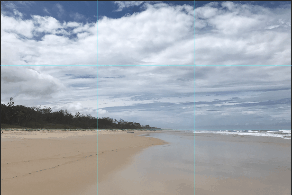
Likewise, you can place important elements on the vertical lines too.
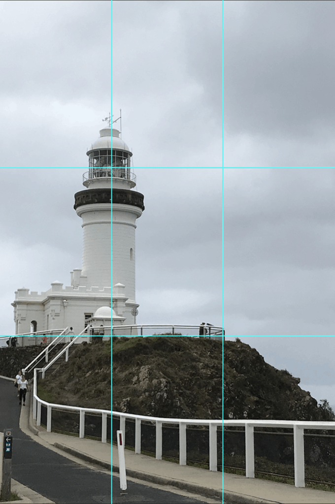
For the most dynamic composition, place the elements you wish to emphasise in one of the four areas where the lines intersect. Notice how the photo of the lighthouse above places the top of the lighthouse in the top left intersection and the base of the lighthouse where it meets the land is placed on the bottom left intersection.
You do not have to place things in all 4 intersections. Just one or two would work well.
Also, notice how the railing leads your eye in from the bottom right of the image to the bottom left intersection at the base of the lighthouse. Leading lines drawing the eye into a picture is also an important and widely used compositional tool.
When dividing your sketchbook spread or deciding where to place things, an appreciation of such a well-established and effective compositional tool such as the rule of thirds is important to consider in order to make your layout feel more harmonious. It also helps to prevent you from plonking things right in the centre of the page. Sometimes this can work but more often than not, having elements placed according to the rule of thirds is going to look far more interesting.
Scale
Visual artists use the concept of scale to help create dynamic work. The size and proportions of one item next to another, especially if unexpected can create real visual tension. You can also play with zooming into certain details and then a wide-angle or zoomed-out version. Scale can help build a sense of hierarchy too – elements that are larger on the page have more emphasis and lead us to feel they are more important or significant.
Some of my favourite online classes
- Pictorial Sketchbook with Gouache – Maru Godas
- Watercolor Portrait Sketchbook – Carlos Rodriguez Casado
- Sketchbooking For Beginners: Learn to Draw Your Surroundings – Maximilliano Vera Herrera
- Urban Sketching: Capture You City in Motion – Inma Serrano
- Certificate in Urban Sketching- Ian Fennelly
Repetition & Rhythm
Repetition can be used to connect elements throughout a layout and help to create overall harmony. You could use the repetition of a certain colour or technique or theme.
The concept of rhythm (in design) takes the idea of repetition a step further and refers to the repositioning of design elements to create a flow. Elements are not repeated in the same way as their first iteration or in the same sequence. You can repeat elements by playing with scale, placement and colour, just as an example. The idea is to create a flow throughout the spread.
In the sketch below, by Inma Serrano, you can sense a rhythm of how she repeats her figures across the spread. She doesn’t repeat the same people but the style and sense of humour link the sketches together as she places the figures across the page.
Symmetry & Asymmetry
Symmetry is everywhere when it comes to design, you can see it in architecture especially, as well as many other fields. Symmetry helps to create a sense of balance. There are three types of symmetry: reflection, rotational and translational.
Reflectional symmetry is probably what most people think of when they think of symmetry. This is where an element is reflected or mirrored across a central axis.
Rotational symmetry is when an element is repeated and rotated around a central point. Translational symmetry is where the element is repeated exactly as it is along an axis, this links in with the section above regarding repetition and rhythm.
Asymmetry is the absence of symmetry. In design, asymmetry can be used to create tension and drama. Asymmetry is when elements on either side of an axis are unbalanced, for example, they differ in number or size. Even though the elements on either side differ, it is still possible to create a sense of balance. Using asymmetry effectively is a bit more complex to master but can lead to more creative freedom. Likewise, using symmetry can also appear boring and uninspired as it is an easy and expected way to lay elements out. It’s a fine line to tread but something worth experimenting with.
White Space / Negative Space
Keep in mind that the space you don’t fill is just as important as the space you do fill. You can create beautiful minimal spreads with lots of white space giving your elements breathing room. You could deliberately do the reverse though. I love seeing super busy sketchbook spreads with things overlapping and a cacophony of colour. I don’t know where to look first but trying to figure things out keeps me drawn to the spread. I have not done this much in my own work, I think it takes quite a healthy dose of confidence but now I have given it some thought, perhaps its something I will try soon in my own sketchbook!
[Side note: This is why I love writing these posts, it gives me some many new ideas to try out – I hope you feel the same about reading them!]
Colour
Colour is such a powerful tool to tell a story with. An urban sketcher who springs to mind is Inma Serrano. She uses colour so effectively and vibrantly. She uses fluorescents, singular or accent colours to tell stories with her sketches. Think about how you can use colour in your sketchbook spread as a layout tool. Perhaps you could create monochromatic sketches and use one additional accent colour throughout. Or you could use a limited palette of colours for each of the sketches. Or take a leaf out of Inma’s (sketch)book (sorry – I had to) and use some fluorescent yellows or pinks to tie everything together.
Final Thoughts
As you can see there are a lot of factors you can play with in order to create a dynamic sketchbook spread. Don’t get carried away with worrying about all of these things, just pick one storytelling device and perhaps one layout element to focus on and see how that turns out.
Of course, you can totally ignore all of these factors. They are well-established design principles but you are an artist and you officially have permission to throw the TV out of the hotel room window and do whatever you want!
The aim of this post is to highlight some areas to think about and to inspire you. I hope you can use the ideas and principles discussed as a jumping-off point. It’s your sketchbook and your art. Go wild.
Comments are closed.