Using a limited a palette (especially when it comes to urban sketching) is an excellent strategy to combat certain issues that may otherwise spring up and take time away that could otherwise be used for sketching or painting.
Putting a limited palette together can be super useful for people who feel they want more of a system to how the use and apply colour. Introducing restrictions like this can be beneficial to your overall sketch in multiple ways.
We shall go into these throughout the article as well as discuss how you select and put together a limited palette.
This post is ideal for you if you feel a bit lost adding colour to your sketches. I certainly went through the stage where I would do a good line sketch but when it came to adding colour, I always felt I lost it and ended up ruining my sketch.
When you have a better knowledge of how to apply colour and a limited choice to work from this can really help to pull your sketch together.
What’s the issue?
Using a limited palette is good training and can help you avoid some common issues sketchers come across, especially if you are new to the world of colour, or more specifically watercolour.
If you are concerned that your colours tend to end up looking a bit muddy, then using a limited palette can assist with this. Creating all hues and tones from a set of 3 colours, for example, can automatically make a sketch appear more cohesive.
Sometimes it’s easy to get overwhelmed by the choice of so many colours. You don’t know which one to use or which colour to mix with another to make a third colour. However, using colours directly from the pan for an entire painting can end up looking, for lack of a better term, “amateur”.
When using watercolour, speed is certainly a factor, especially if you want to achieve certain techniques such as wet in wet. Using a limited palette can help you make quicker decisions, right or wrong!
Benefits of using a limited palette
There are many benefits to using a limited palette. You will find most urban sketchers carry a palette of 8-12 colours. Some colours will be on the palette for convenience, so they do not have to be mixed from scratch every time.
Speed is important when it comes to urban sketching so saving time on not having to mix the same colour each and every time, especially if you use it frequently, is far more efficient.
The benefits I have experienced from working with a limited palette are:
- Focus on value more than colour
- Keep my painting kit to a minimum
- Learn to mix colours more confidently
- Helped me to understand colour theory in practice
- Achieves better colour harmony
Examples of Limited Palettes
3 Colour Limited Palette
When it comes to watercolour, a limited palette of 3 colours is usually some form of red, yellow and blue. When I say this you probably have a picture of 3 very primary versions of these colours. However, the red could be a slight violet-red, perhaps the yellow is a yellow ochre and the blue is more of a turquoise.
Will this work?? I have no idea.
But that’s the joy of selecting 3 colours, you need to experiment to see what you can get out of them and how far you can stretch them. If anything will teach you about colour mixing, this is it.
Myth: you can mix absolutely any colour from the three primary colours.
This is not true (hence me labelling it as a myth I suppose)!
Want to learn travel sketching in ink & watercolour?
Check out my course, Sketch Your Adventures and for a limited time get 50% OFF!!!
How to choose which 3 colours
The best way to select the 3 colours you want to use in your limited palette is to create a watercolour mixing chart to understand what hues (colours) you can achieve from the red, blue and yellow mixed in various combinations.
If you paint a lot of subjects where you need certain shades of green or at least the ability to mix a variety of greens, test this by making a chart.
In many cases, especially if you are out sketching on location and are used to sketching multiple subjects, 3 colours may just not be the right solution for you. However, it is still a fun system to stretch yourself with and I highly recommend challenging yourself to do this, even if it’s just at home.
James Gurney has an excellent video demonstrating this very concept:
James Gurney has quite a few videos where he paints with a limited palette. In the video below he uses the 3 secondary colours instead of primary colours. This is an interesting twist and something I am keen to experiment with!
Warm colours vs cold colours
When selecting the 3 shades of red, yellow and blue to work with, you need to consider whether they are warm colours or cold colours. You can determine this by analysing which colour the primary leans towards on the colour wheel.

If a red looks more orangey-red, then it is a warm red. For example, Pyrrol Red is considered a warm red. If a red look more violet-red then it is a cold red, for example, Alizarin Crimson.
If you mix a cool red (e.g. Alizarin Crimson) with a cool blue (so a blue that leans more towards violet on the colour wheel) then you are going to get a beautiful shade of purple. However, if you use a warm red and a warm blue, you are going to get a muddy purple. This is also true if you use one cold and one warm version of each colour.
The best purple will be achieved with a cold red and a cold blue.
The best orange will be achieved with a warm red and a warm yellow.
The best green will be achieved with a cool yellow (as it leans more towards green on the colour wheel) and a warm blue (as this also leans more towards green on the colour wheel).
Some of my favourite online classes
- Watercolor Portrait Sketchbook – Carlos Rodriguez Casado
- Creative Watercolour Sketching for Beginners – Laura McKendry
- Experimental Watercolour Techniques For Beginners – Ana Santos
- Sketchbooking For Beginners: Learn to Draw Your Surroundings – Maximilliano Vera Herrera
Split primary system
This leads us on to what’s known as the “split primary system” which contains 3 warm versions and 3 cold versions of red, yellow and blue. From these 6 colours, you should be able to achieve a wealth of hues.
My first experience with using this system is when I purchased the Daniel Smith Essentials Set. I had never used Daniel Smith paint before either so this was a perfect introduction.
The first thing I did was to create a colour mixing chart as you can see in the photo below.
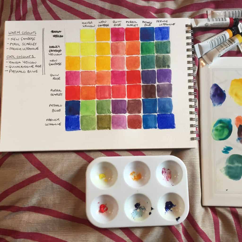
This helped me to understand what was possible from the 6 colours but also became a super handy reference as I painted so I knew which colours to mix together.
Check out my ebooks with hundreds of ink & watercolour travel sketches from all over the world. Get some inspiration for your next trip…

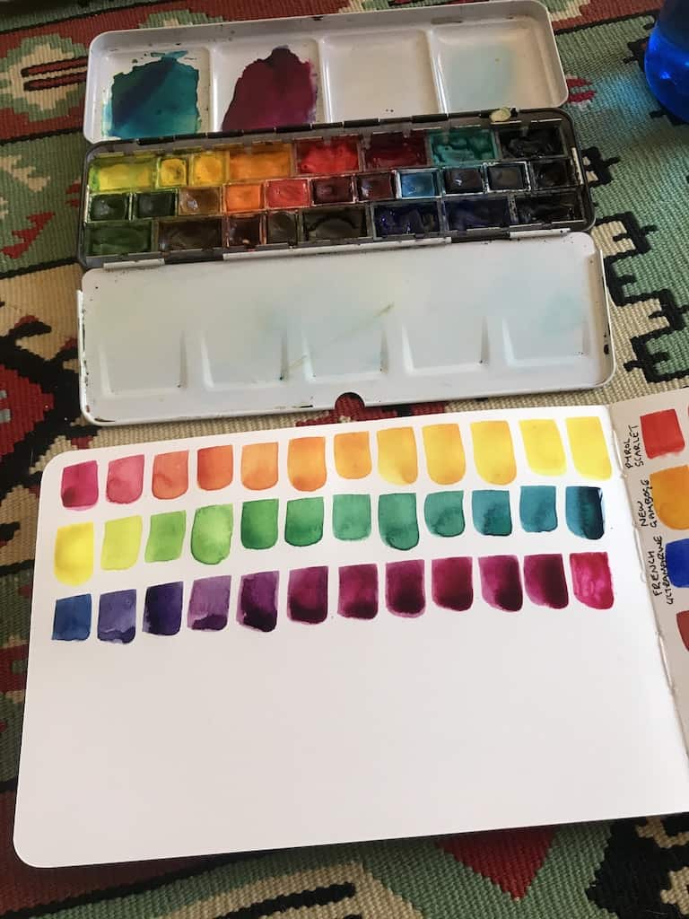
If you are interested in learning how to make your own watercolour mixing chart I have a video below and a blog post here about how to do it. I created this watercolour mixing chart with my 14 pan St Petersburg White Nights Set but the method remains the same whatever watercolours you use and however many.
For more information on colour theory in general, check out my post here.
Extended limited palette
For some, even the split primary system is not going to be the right choice or offer the flexibility or perhaps convenience that comes from having certain shade ready and pre-mixed on your palette.
If you paint a lot of landscapes, do you really want to have to mix greens and browns every single time? Would it be more convenient to have one shade of green and one shade of brown already on your palette? Then do it. There are no rules you have to stick to. You can do whatever you want.
Final Thoughts
I hope this post has encouraged you to try out a limited palette and also to experiment with different combinations.
If you would like to see my try out a sketch with a limited palette of 3 primary colours, check out the video below. It wasn’t the most successful experiment! I didn’t think it through but perhaps my errors can save you a bit of time so you don’t make the same mistakes!
For more information on colour theory for urban sketchers, check out this post.
To learn how to make a watercolour mixing chart of your own, check out this post.
To stay up to date with Urban Sketching World, join the newsletter below!