Architecture is one of the key elements in an urban sketch (generally speaking), yet it can also be one of the most intimidating elements to sketch.
In this post we will look at some of the key elements to consider when sketching architecture, such as common types of perspective, simplifying complicated architectural elements, conveying convincing materials and textures, composition and loose sketching versus highly detailed work. I will provide examples from prominent urban sketchers along the way.
Let’s get into it.
Perspective
One of the keys to a successful architecture sketch is drawing elements in perspective. Perspective is a fundamental skill in drawing in which we can make objects on a 2D surface appear more 3D. This makes the results of the learning perspective super satisfying.
Most urban sketchers are not slaves to perspective. We are not architectural illustrators for example (although many urban sketchers do come from the field of architecture). Urban sketchers won’t generally map out their sketch with perspective lines converging at the vanishing points as it takes away from the ‘sketching in the moment’ and perhaps the looser feeling some sketchers want to achieve.
Once you understand the principles of perspective, it can be simple enough to gauge perspective by eye rather than using lots of guidelines.
There are some tips and tricks that can be used to still arrive at a reasonably accurate drawing in perspective.
One Point Perspective
One point perspective is where all the lines of your building (or subject) converge to meet at one point on the horizon, known as the vanishing point.
This sketch by Phil Dean (@shoreditchsketcher) demonstrates the use of one-point perspective beautifully. You can see all of the lines converging to one point in the horizon far off the right of the page.
Here’s another example of a one-point perspective by Alicia Aradilla. You can see that the tops of the skyscrapers also angle downwards to line up with the vanishing point on the horizon:
Two Point Perspective
As the name suggests, this type of perspective features two vanishing points on the horizon line.
In my sketch below you can see how the corner of the building is prominent in the sketch and we can see down both sides of the building, both have converging lines towards a vanishing point outside of the page.
Want to learn travel sketching in ink & watercolour?
Check out my course, Sketch Your Adventures and for a limited time get 50% OFF!!!
Architectural Elements
It can be very easy to get overwhelmed by complex architectural details, especially on older buildings.
Gothic architecture is a mind-blowing style of architecture with huge amounts of details all over the building, but do we need to capture them all? And do we need to capture them accurately? No. I mean, you can if you want. But, well, good luck.
Sketching complex architecture is actually (now) one of my favourite things to sketch. I actually find the ‘busier’ a building looks, the easier it is to capture its essence as the building is so distinctive.
Below is my sketch of Westminster Abbey – a very complicated looking building. But as you can see if I have sketched it a very stylised way, you can certainly still recognise the building is Westminster Abbey but I certainly have not captured accurate details. I have hinted at them by using a sort of visual shorthand.
In fact, you can watch me sketch Westminster Abbey in the video below:
By watching closely you can see how I am very loosely capturing the multiple details with basic mark-making. Up close it may look a bit loose but you will find, once you step back and look at the bigger picture (pun intended) that the overall effect is pretty convincing. I suppose it’s a similar concept of looking at an oil painting close up and seeing lots of random splodges of colour, but step back and look at the whole and it looks incredible.
Materials & Textures
Conveying the materials used and capturing the textures of these materials can really help to enhance an architectural sketch.
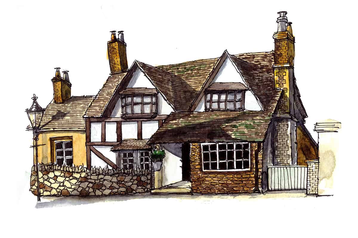
In my sketch below, the subject is a medieval English cottage made from timber beams, with a slate roof and in the foreground a stone wall. While I don’t think I did a good job of conveying the texture of those timber beams, I was quite happy with the texture of the roof and the stone wall.
It’s wise to be selective as to what details you include and which you omit otherwise your sketch can run the risk of being overworked or overbearing. Sometimes less is more.
In this sketch, my subject matter was basic and as such, I wanted to capture the textural elements as much as possible, as they essentially make the sketch come alive.
The moment I saw this hut on top of another hut, I knew I just had to sketch it. I found it so magical! The huts are actually food stores built by the Toposa tribe of South Sudan, one of Africa’s most remote tribes.
Check out my ebooks with hundreds of ink & watercolour travel sketches from all over the world. Get some inspiration for your next trip…
Composition
In the sketch below by Danny Hawk, you can see how he has placed the lion statue in the foreground in front of the Duomo Cathedral in Milan (which, by the way, has the most insanely scary amount of detail and ornamentation on a building I’ve ever seen).
If you look closely, Danny absolutely hasn’t tried to capture the many statues and ornamentation plastered all over the building and instead has focussed on the key features such as the overall contour of the building, capturing the numerous spikey towers at the top.
He has also left the people in the foreground as negative shapes, this is one of his trademark techniques.
By including the lion statue and the negative shapes of the people in the foreground, the focus is not entirely on the Duomo and the sketch tells more of a story.
Ian Fennelly creates masterful compositions using colour to direct the focus. In the sketch below Ian uses bright colours for the buildings on either side of the sketch, that are in the foreground and paler neutral tones for the building in the distance.
The way in which Ian has used colour as well as one-point perspective, the colourful buildings in the foreground converge towards the paler distant building, leading our eye directly to the intended focus of the sketch.
Tom Pajdlhauser, a.k.a ‘Captain Tom’, is one of my favourite urban sketchers when it comes to composition.
In the sketch below, it’s almost as though his drawing is contained within the sweep of a brush across the page. I find it a captivating and incredibly beautiful use of space across the sketchbook spread.
For more information about how to design a dynamic sketchbook spread, check out my post here.
Loose Sketches
Liz Ackerley has a distinctive ‘colour first’ approach which gives her architectural sketches a very loose feel.
Liz Steel achieves beautiful loose sketches of architecture. I’m sure being from an architectural background it took her a long time to diverge from the type of drawing required in the field to find her own more gestural loose style. I think Liz is also a fan of a colour-first approach, using linework sparingly (if at all).
Simone Ridyard is also from an architectural background and while her sketches are highly detailed, featuring lots of linework, they also achieve a sense of looseness, perhaps achieved by her minimal (and loose) use of colour.
For more information on how to sketch loosely, you can check out my post here.
Some of my favourite online classes
- Exploratory Sketchbook: Find Your Drawing Style – Sarah Van Dongen
- Expressive Architectural Sketching with Colored Markers – Albert Kiefer
- Architectural Sketching with Watercolor and Ink – Alex Hillkurtz
- Greatest Hits of London-Ian Fennelly
Highly Detailed Sketches
Paul Heaston is the king of detailed sketches! Just take a look at his Instagram feed and you will see detailed car engines, rooms in a fish-eye perspective that includes his own hands drawing in his sketchbook and also some architecture.
Paul tends to stick to sketching with pen and ink, working in a small format sketchbook. He is also a fan of using a toned sketchbook, his favourite being the Stillman and Birn Nova range (here on Amazon)
Phil Dean is a deceptive sketcher, his work seems so highly detailed when looking from afar, however, on close inspection he is not a slave to the details at all. His signature wobbly lines are usually created on location and then he tends to colour his sketches at a later date using markers.
Phil tends to use either Copics or Promarkers, you can find starter sets of these markers in your local art store or here on Amazon.
Zheleznaya Nadya is an urban sketcher from Minsk, Belarus. She sketches highly detailed and realistic scenes, using her landscape format sketchbook in interesting ways to compose her sketch.
I love how she fills the entire page and never leaves any white space which feels in total opposition to the approach of urban sketcher, Captain Tom (mentioned above).
This is the beautiful thing about urban sketching, artists capture things in entirely unique ways, allowing us to see things through their eyes and showing us the world in a new way we would never have imagined.
Zheleznaya also uses markers for her urban sketches.
If you would like to learn more about urban sketching with markers, check out my post here.