In this post, we are going to take a look at how to make a mixing chart from the colours you have in your watercolour palette. This is an amazing but also vital way to get to understand your colours and how they behave with each other as well as creating ain invaluable reference tool so you know how to mix any colour you want quickly.
This post is useful for beginners and experienced sketchers. Making charts such as these is something I have put off for a long time but as soon as I actually made the effort to make one I realised how invaluable the process of making the chart and the final product is for future sketching. By spending time making the chart you save time in the long run by taking some of the guesswork out of colour mixing.
Even if you are well versed in colour theory and the mechanics of how colours and pigments work, there is no substitute for direct experience.
Please do not skip making a watercolour chart (like I did) for years. Do it now. It is one of the most useful things you can do to take a leap forward in learning how your watercolour paints work.
What is a Watercolour Mixing Chart?
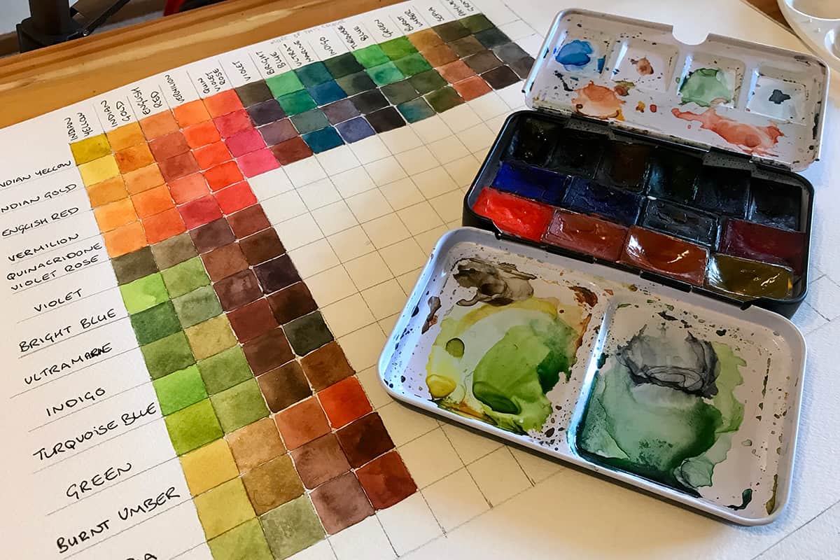
A watercolour mixing chart is usually in a grid format and allows you to mix record a range of colours achieved by mixing one colour with another.
The chart has a defined range of pigments along the horizontal axis and the same pigments along the vertical axis, where one pigment meets another on the grid is the resulting colour from mixing them together.
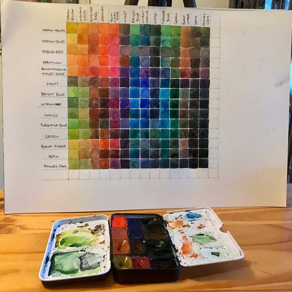
Due to the nature of this grid system, each colour will meet on two occasions. In order to not get duplicate mixes, you can decide that one axis will have more of the colour than another.
Let’s imagine we are mixing Indian Yellow with Ultramarine for example, which you may be able to locate on the grid above.
Where Indian Yellow is labelled on the top edge and Ultramarine is labelled on the left edge, the mixture will have more Indian Yellow than Ultramarine and the resulting colour is a more yellow-green.
Where Ultramarine is labelled on the top edge and Indian Yellow is labelled on the left edge and the colours meet again (on the top row of the image above) there is more Ultramarine in the mix, the resulting colour is more of a blue-green.
In this way, you get two different results from the colours mixing and a more effective reference tool. Check out the Youtube video and the section below on how to make the chart for more detailed step by step instructions.
Why is it Important to Make a Watercolour Mixing Chart?
There is no better way to understand colour theory than to practice it. Also, there is no better way to understand the paints in your palette and how they mix together than experimenting and keeping notes on which colours mix with which to produce certain results.
The most efficient way to do this is to make a chart. There are a few different ways to make a watercolour chart but I will show you the way I most frequently make one.
When you buy a new watercolour set or new pigments to put into your set I highly recommend you make a chart that you can refer to. You cannot tell the real colour from looking at the packaging or the tube. You can make swatches of the colours directly from the pan. By making swatches you can see how bright the colour is as well as how transparent or opaque it is.
The next thing you want to understand is how the colours mix together and what results they produce and this is where the mixing chart comes in.
If you have a regular sketchbook you carry with you for all your urban sketches, I recommend making the chart in your sketchbook. If you don’t tend to use a sketchbook then you can use any watercolour paper to do this. I have a large chart stuck to my wall at home to refer to when I paint there and a smaller version which is not quite so neat in the back of my sketchbook for quick reference.
Having such a chart to refer to will save you so much time when you’re out painting and trying to achieve a certain shade. Over time you may refer less and less to your chart and colour mixing will become instinctive. However, as soon as you change your pigments then you will need a new chart!
Some of my favourite online classes
- Sketching People with Watercolour – Marcus Penna
- Creative Watercolour Sketching for Beginners – Laura McKendry
- Architectural Sketching with Watercolor and Ink – Alex Hillkurtz
- Artistic Watercolour Sketching: Dare to Sketch – Felix Scheinburger
How to make a watercolour mixing chart?
If you would like to watch how I made my watercolour chart, check out my Youtube video below.
If you prefer to read the directions then scroll past the video for my step by step explanation.
I have 14 paints in my St Petersburg watercolour set, so I knew this was going to result in quite a large chart but I really wanted to see the wide range of colours I could achieve from this “urban sketching set”. I bought this set directly from St Petersburg here.
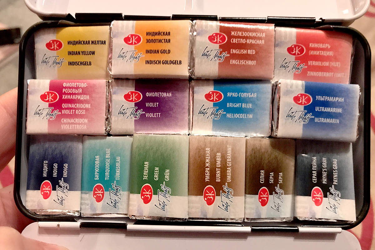
The set I received contains one different colour than listed, instead of Venetian Red I received Vermilion but that was ok.
The colours I have in my set are as follows:
228 Indian Yellow
244 Indian Gold
321 English Red
357 Venetian Red 312 Vermilion
622 Quinacridone Violet Rose
607 Violet
509 Bright Blue
511 Ultramarine
516 Indigo
507 Turquoise Blue
725 Green
408 Burnt Umber
413 Sepia
812 Payne´s Gray
This is the order I have them arranged in my metal tin and also the order I listed them on my mixing chart.
Just a side note on this particular set, it’s not a set I can find for sale anywhere else other than directly from St Petersburg. The metal tin is not custom made to fit these pans and as such getting the pans in and sitting right is actually a bit of a squeeze.
The St Petersburg White Nights paints that come in plastic palettes that you can find on Amazon and other art supply companies are actually made for the pans. Here is the set of 12 colours on Amazon.
I have the 24 pan set in a plastic box arriving soon as that’s all I can get hold of at the moment in South Africa (and some of my colours are running out) so I will be sure to let you know what my thoughts are on this set too.
As I had 14 paints I wanted to make a chart for and I did not want my squares to be too small I used an A3 piece of watercolour paper.
If you have fewer colours and don’t mind making your squares a bit smaller I highly recommend creating this chart in your sketchbook so it’s always with you to refer to. I have a very small sketchbook currently so I knew this was not going to work for me.
I wanted to make a grid with 2 x 2cm squares for my chart but realised my paper was not wide enough so I used 1.5 x 1.5cm squares instead which actually seems a great size. 14 colours multiplied by 1.5cm is 21cm, so this is how big my square needed to be.
I drew a 21cm line across my page and then down my page and continued until I had a square. I then marked 1.5cm intervals vertically and horizontally, joining the dots to create my grid.
Make sure you leave some space around your grid in order to write the colours along the side and along the top.
I labelled each row with the name of the colour, starting with Indian Yellow and ending with Paynes Gray, as per my list of colours above. I did the same thing with each column.
Now it’s time to paint.
Make sure you have two jars of water. This is very important. I made my task so much longer as I did not do this and had to keep getting up to change my water periodically.
You need one jar of water to clean your brush in which will end up with dirty-looking water and then a jar of clean water which you use to wet your paint.
If you only use dirty water continuously you will contaminate your paints and not end up with an accurate mix. When you are trying to produce a reference tool such as this, it’s important to try and be as accurate as you can.
You will also need a paper towel or two to dry your brush on and a nice big space to mix colours on if you can.
Using a flat brush is an advantage in making the chart as it will be easier to make a nice crisp square shape and paint the colour in one nice sweep. I did not have a small enough flat brush to paint these squares but my small dagger brush was the next best thing. If you only have a round brush then just use that, it’s not a big deal.
Start in the top lefthand corner where your first two colours meet. On my chart, this is where Indian Yellow meets Indian Yellow, so in this square, you would paint pure Indian Yellow from the pan.
Staying in the same column where Indian Yellow is the label on the top axis and moving down one row where Indian Gold is labelled on the left axis, I need to paint a square that is Indian Yellow with just a bit of Indian Gold mixed in. This is because the colour on the top axis is the dominant colour in the mixture.
As I have Indian Yellow mixed with a bit of Indian Gold already on my palette, I now mix in some more Indian Gold, so that colour is the dominant colour in the mix and I paint the second square in the top row (to the right of the very first square we painted) with this mixture. This is because Indian Gold is the label on the top axis and this is the dominant colour in the mix now, with only a bit of Indian Yellow in the mix (which is labelled on the left axis).
Do you want to learn how to sketch your own adventures in ink & watercolour?
GET 50% OFF FOR A LIMITED TIME ONLY!!
I will show you my exact sketching process in ink and watercolour. I have travelled around the world in the last 3 years and this is my go-to system of creating beautiful yet quirky illustrations to capture the magic of my discoveries.
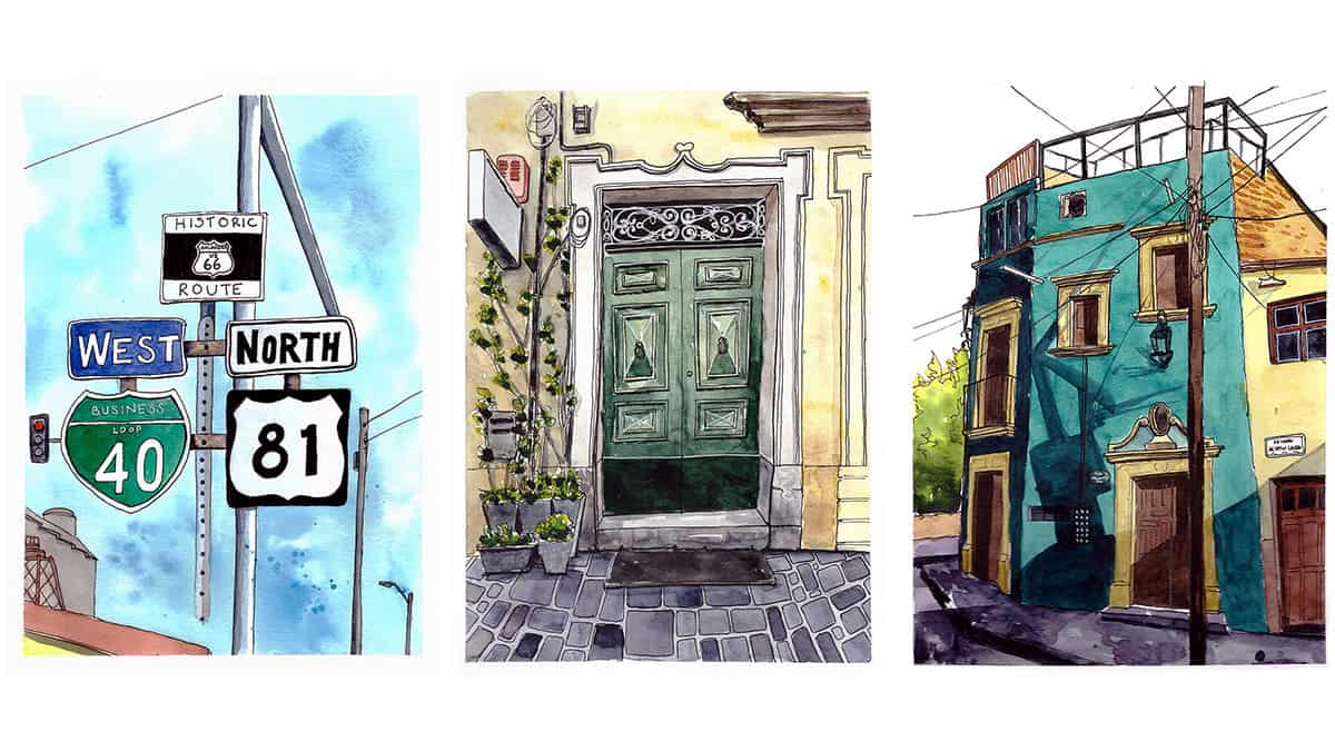
We will work through 3 projects, step by step (pictured below), all of which are real-life examples of things I have sketched along my travels. I provide the photo references you can work from.
We will start by choosing a composition, laying in the initial pencil sketch, adding ink lines, layering watercolour and adding the final touches.
This and much more are included in my course, Sketch Your Adventures, click the button under the image to find out more!
If you work in this way, doing two squares at a time and varying the levels of each colour, you will make the chart a little quicker.
Let’s do the next square in the sequence. Make sure you have washed your brush in one jar of water and then picked up the fresh clean water from the other jar to start a new mix.
Start with a fresh pool of Indian Yellow (we are still sticking with the first column of the chart) and mix in a little bit of English Red (as that’s the colour in the next row down from Indian Gold), paint this square.
Now add a bit more English red to the mixture to make it the dominant colour and find the column with English Red labelled on the top axis (because it’s now the dominant colour) and the row labelled Indian Yellow and paint that square.
Continue onwards in this way.
Where the same colour meets each other, for example, English Red and English Red, that’s where you need to paint the pure pigment from the pan.
These occurrences of two of the same colours meeting each other will be in a diagonal line from the top left of the grid to the bottom right.
Try to use a consistent amount of water when you are mixing colours so that you do not adversely affect the vibrancy by using too much. This can be tricky at first but you will get used to it as you move through the chart.
Making this kind of watercolour chart does require some patience and concentration. It took me a few hours to make my chart and I had to keep reminding myself of which colours I was using and where I should paint which mixture. I find it’s quite easy to forget what I am doing, but perhaps I just have a monkey brain!
Final Thoughts
I know you would rather spend time sketching but this is such a valuable use of time too. It helps to cement colour mixing theory in your head and can be used as a future reference tool that you can keep in your sketchbook or stick on the wall at home. Creating this chart now will actually save you time and increase the success of your sketches in future.
If you are interested in reading more about colour theory, check out my post here.
I hope this post was useful and good luck in making your own colour mixing chart!
If you have any questions at all I would be happy to help, just email me: taria@urbansketchingworld.com
For more urban sketching inspiration and a sneak peek behind the scenes of sketching projects I’m working on, join my newsletter! I aim to email twice a month, so I will never bombard you!