Urban sketching is an art form that captures the essence of cities, towns, and streets around the world. Just like with any art form, there’s a huge variety of styles and mediums urban sketchers use to convey their chosen stories.
Artists like Lucinda Rogers, Lyndon Hayes, Tim King, and Pat Southern Pearce have redefined the genre, infusing their works with life and energy, and pushing the boundaries of traditional sketching techniques. In this blog post, we’ll explore the captivating world of urban sketching on colour paper and learn some practical tips on how to create your own stunning pieces.
This article focuses on colour paper, however, if you are interested in sketches on toned paper such as tan/beige or grey then check out this post: Urban Sketching on Toned Paper.
The distinction between colour and toned paper is my own – I find it easier to separate them using these labels as I think it’s worth discussing them in their own right.
Drawing Inspiration from urban sketchers who use colour paper
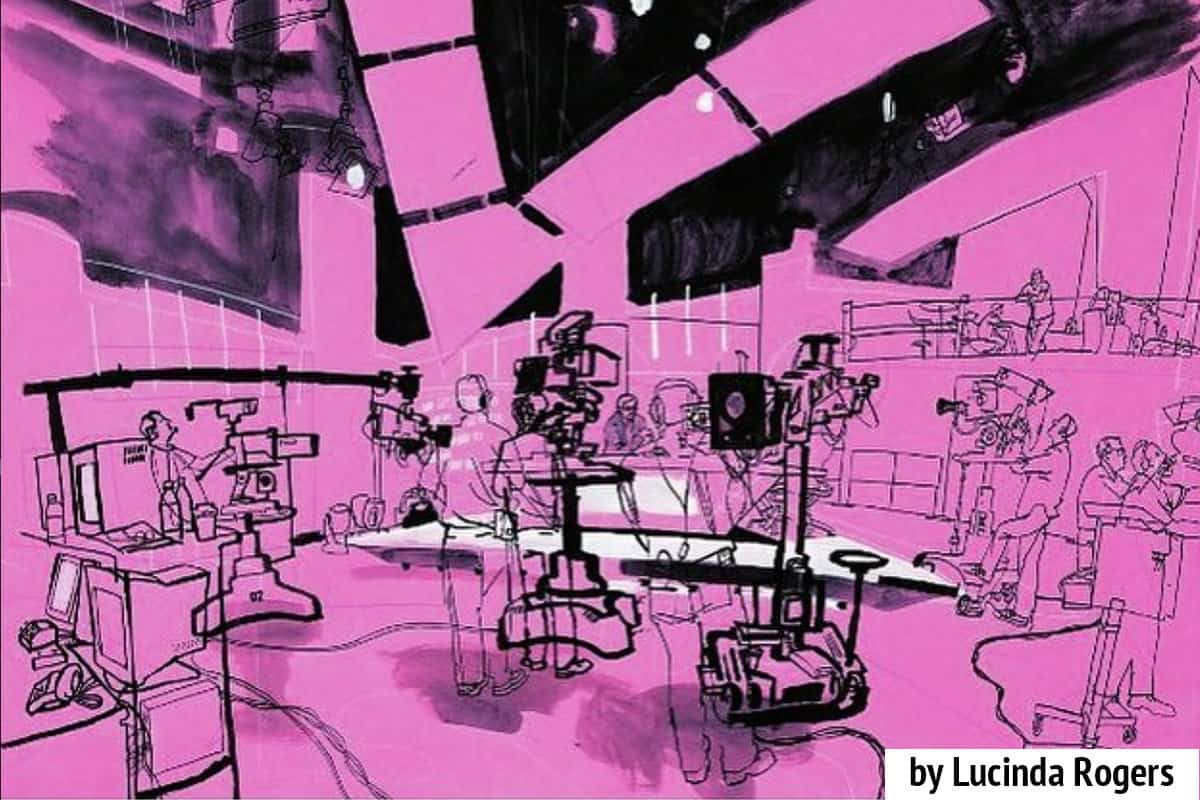
Lucinda Rogers
Lucinda Rogers is known for her bold and dynamic sketches, she has a distinctive style that conveys the essence of urban life. Her use of colour paper adds a unique dimension to her work, allowing her to evoke emotions and create a powerful connection with the viewers.
“Lucinda Rogers works from life in the tradition of the artist as reporter. She immerses herself in an environment and records straight from eye to paper, which gives her drawings a particular spontaneity. Her work records the intimate details and broad views of the changing city she lives in, London, and others she is drawn to including New York and Marrakech. Alongside her own work she has had a prolific illustration career working regularly for the mainstream press and countless other publications and companies, often being sent out to draw on location as a reportage illustrator.”
Lucinda Rogers’ website.
Using a mix of ink, watercolour, and other dry media, Rogers creates highly detailed and expressive sketches that bring life to the scenes she portrays. Her ability to convey the hustle and bustle of city life, as well as the unique architectural features and human interactions, is what sets her work apart. I feel like her use of thick black lines to accentuate certain areas of her sketch, drawing the eye to the focus, is a key trademark to her style.
She leaves a lot of the colour paper behind, predominantly just drawing on top. Occasionally adding small accents of colour to some foreground elements. You can tell she mainly works on location by simply looking at her work: her marks are quick, loose, spontaneous, instinctual and above all full of energy – something that would be extremely difficult to achieve anywhere other than on location, immersed in the scene.
Lyndon Hayes
I feel like Lyndon Hayes has two distinct styles of sketching. One is his use of colour fine line markers. He uses one colour for background elements and a different colour for foreground elements. I demonstrate this technique (amongst hundreds of others) to members of my private membership group, which you can find here. He creates illustrations on location with intricate lines. I feel like he uses this style for his personal urban sketches.
The other predominant style I see him use is not too dissimilar from Lucinda Rogers. I feel like he employs this style for his reportage work. This is my perception however and I cannot find evidence to back this assertion up. Although I feel his use of two separate Instagram accounts – one for personal work and one for professional work – actually makes this unwritten distinction.
Hayes’ urban sketches on colour paper stand out with their intricate details and masterful use of various media. His compositions capture the spirit of bustling cities and showcase the diverse textures and architectural features that make each location special.
I love his use of accent colours in his work. For instance, in the sketch below, he doesn’t feel the need to fill the entire t-shirt of the man on the right. Similarly the pale blue-grey colour in the background around the animal head. Being able to pull this off effectively is a testament to his skill in what can be left unsaid. Note both his use of line weight (fine vs thick) and also colour (black vs grey) to create focus and depth in the sketch.
I highly recommend checking out Lyndon’s Youtube channel where talks through his sketchbooks over the years and how his style has developed. I find them fascinating to watch and listen to. Here is one example below:
Tim King
Tim King is a reportage illustrator from London.
Tim King’s works on colour paper exude a sense of atmosphere and mood. He skilfully combines loose, gestural lines with bold colour choices to create visually arresting urban scenes.
The thing I love most about Tim’s sketches is that they are simple vignettes of everyday life injected with a bit of a sense of humour, often by including written snippets of conversation or remarks.
His sketches are reasonably minimalist and I think that’s why the combination of bright colour paper works so well. Less is most definitely more when working on brightly coloured paper.
Tim is well known for his Drawing A Day project back in 2014, that’s how I found out about him. He has more projects like this, most notably one during 2020. He has a book available which he raised funds for via Kickstarter. You can watch a short film about his daily drawing project below:
Pat Southern Pearce
Pat Southern Pearce’s urban sketches on colour paper are marked by their vibrant and lively nature. She has an extremely distinctive style whereby she often creates a dramatic sky to demarcate the negative shapes of a skyline of buildings beneath.
Pat Southern Pearce is certainly not afraid of colour but she is also a master in knowing where to leave the colour of the paper. This really is the art of drawing on brightly coloured paper.
Pat tends to use dry media such as watercolour pencils (without applying water), markers, paint markers, crayons and gel pens.
The other thing Pat is well-known for and is distinctive about her sketches is her lettering style. It’s beautiful and in my opinion as much a part of the sketch as her drawing.
If you would like to scroll through sketches on colour paper, you can take a look at my Pinterest board here where I have collected many examples together.
Practical Tips for Drawing on Colour Paper
Selecting the Right Paper
When embarking on urban sketching on colour paper, it’s crucial to choose the right paper that suits your style. Experiment with various types of coloured paper to find the one that complements your artistic vision. Consider factors like texture, weight, and colour intensity.
Understanding Medium Compatibility
Not all art mediums work well on colour paper. While dry media like coloured pencils and pastels are commonly used, you can experiment with wet media like watercolours or gouache for unique effects. Just be aware of the weight of your paper, will it handle wet media? Always test the compatibility of your chosen medium with the paper before diving into your sketch.
Embrace Contrast
Colour paper offers an excellent opportunity to play with contrast. Use white or light-coloured mediums to highlight and accentuate certain elements of your sketch, creating a sense of depth and drama. Don’t cover the entire paper with colour and cover up the actual colour of the paper – this makes the use of colour paper pointless! I am speaking from experience. It will take a while to get used to it, keep practising and experimenting with where and how you should leave the colour of the paper.
Integrate Mixed Media
Explore the integration of various media to add dimension and visual interest to your urban sketches. Combining ink, watercolours, coloured pencils, crayons or paint markers can result in captivating and dynamic artwork. I prefer dry media on colour paper as I haven’t found exciting colours of paper available in a paperweight that can handle wet media successfully. There are sketchbooks available by brands such as Hahnemuhle, Stillman and Birn and Royal Talens in tan, grey and black paper that can cope with wet media.
Focus on Composition
A strong composition is key to any successful urban sketch. Pay attention to the placement of key elements, use leading lines, and balance negative space to create a visually appealing and harmonious piece.
Some of my favourite online classes
- Watercolor Portrait Sketchbook – Carlos Rodriguez Casado
- Expressive Architectural Sketching with Colored Markers – Albert Kiefer
- Experimental Watercolour Techniques For Beginners – Ana Santos
- Urban Sketching: Express Your World in a New Perspective – Lapin