Urban sketching is the practice of sketching on location and from life. As such we tend to think of urban sketches capturing outside scenes. However, many urban sketchers also turn their attention to inside spaces such as cafes, museums, and in more recent times their own houses.
Trying to figure out how to sketch an interior can be tricky and perspective certainly plays an important part. In this post, we are going to consider the different elements that make a sketch of an interior successful along with examples from some of my favourite urban sketchers.
If you would like a more general guide on how to get started with urban sketching, check out my practical guide here.
If you would like some recommendations on urban sketchers to follow on social media, check out my list here.
I also have some posts that discuss and give examples of how to sketch cars and architecture.
Drawing in Perspective
One Point Perspective
One point perspective is where all lines of an image converge towards one vanishing point on the horizon line. If you imagine standing in the middle of a road looking towards the horizon line, you can imagine all the lines angled to one point in the distance. If you can’t imagine this, here’s a photo of what I mean:

[Photo by Karsten Würth on Unsplash]
In the video below, the artist demonstrates step by step how to go about drawing a room in one-point perspective.
Although the drawing is a little tighter than we would probably want to achieve in our urban sketch, watching the process of how to draw a convincing room in this way is a great first step.
This sort of video is aimed more at architecture or interior design students, however, I think it’s useful to learn from a precise method to then loosen up and imprint your own style on things once you’ve learned the fundamentals.
Sketching a room from a one-point perspective is a great way to show 3 walls of an interior in your drawing, one that is parallel to the viewer, and 2 walls either side.
One perspective is the easiest perspective to use as we are only dealing with one vanishing point.
One-point perspective is particularly useful for depicting larger spaces, such as museums, cafes and restaurants as well as larger interior spaces like hallways and at home, perhaps a living room.
Here’s another video I found very useful in explaining how to draw a room in one-point perspective:
Two Point Perspective
Two-point perspective is where lines in an image converge towards two different vanishing points on the horizon, usually at opposite ends of the line.
Check out the photo below to see what I mean. I have drawn the perspective lines that converge towards to separate vanishing points on the horizon line.
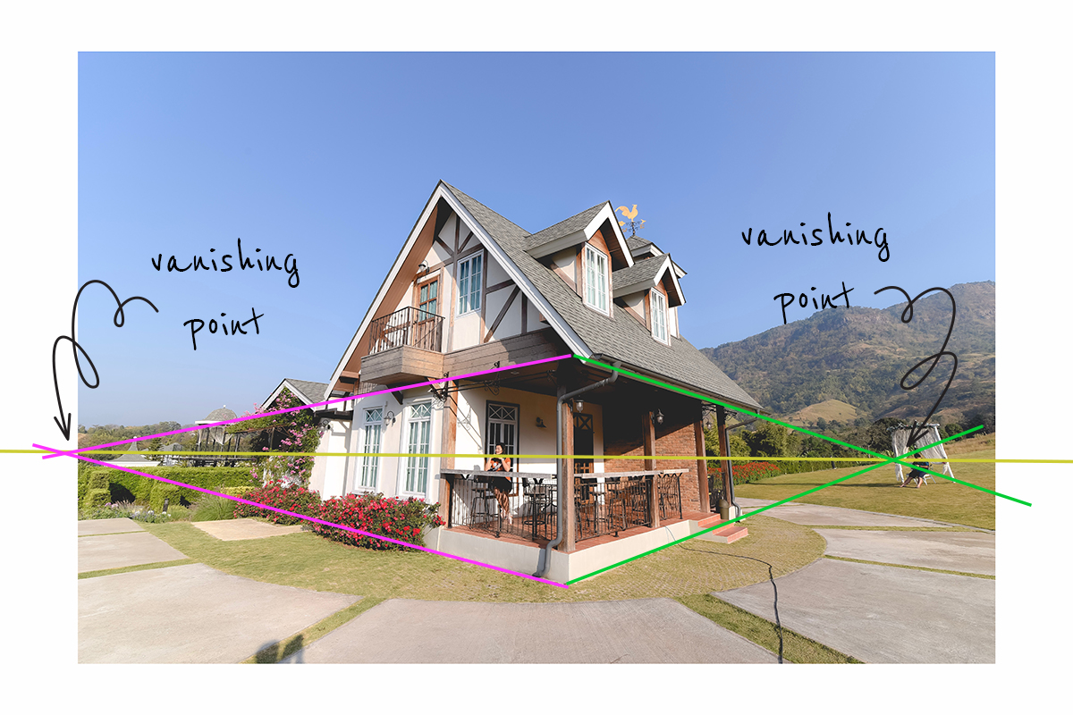
[Photo by Mr.Autthaporn Pradidpong on Unsplash]
Another video from the same source as above, also aimed at architects/designers, but again, it’s a great step by step video to help understand how to achieve a convincing sketch of a room in two-point perspective.
Two-point perspective can be considered a more dynamic perspective than one-point as you can show the volume of objects sitting in the space of the room.
Two-point perspective is best used for smaller spaces or if you want to show a specific corner of an interior. This perspective is also best used when you want to show off one key element in a room, such as the bed in a bedroom or the desk in an office, for example.
Curvilinear Perspective
This is certainly a more advanced type of perspective to tackle but if you achieve it, it looks fantastic. Curvilinear perspective uses 4 or more vanishing points so that the perspective lines are actually all curved rather than straight (hence the name).
Think about taking a ‘panoramic’ photo on your phone and how the resulting photograph sort of ‘bends’ from one side to the other to show as much information as possible.
Our human eyes don’t see things in a curvilinear perspective so I think it can be a tricky way in which to sketch. I think in order to practice sketching in this kind of perspective, taking a photo with your phone in this ‘panoramic’ mode could be a useful reference.
If you are interested in learning more about how to achieve this perspective, here’s a very clear video giving instructions on how to draw in 5-point perspective:
There are a fair few other types of perspective to play with, but the three above are the main ones you may wish to try when it comes to sketching interiors.
As Marc Taro Holmes points out in his excellent blog post over on urbansketchers.org, setting up perfect perspective guidlines for a drawing can actually be pretty boring. Marc, it seems, is not one for perspective. And to be honest, neither am I. I think being a slave to perspective lines can really suck the fun out of sketching.
It’s important to be aware of the concept of perspective and how it works to make our 2D drawings look more convincing but do not feel you have to get everything perfectly in perspective using multiple guidelines. Sketching using strong observation of the subject in front of you can usually do the job just as well.
Want to learn travel sketching in ink & watercolour?
Check out my course, Sketch Your Adventures and for a limited time get 50% OFF!!!
Proportions
Sketching an interior scene with correct proportions which help to create a convincing and accurate sketch. Proportion is the relationship of height or width of something.
You can use your pencil or pen as a measuring device to see how tall something is in comparison how wide it is or to compare heights and widths of two separate objects.
It’s important to note (and something it took me a while to realise) that you are not transferring the actual height of your pen or pencil to your piece of paper, you are just using it to measure ratios. For example, you measure a building as one pencil tall and half a pencil wide. In which case you draw your desired height of the building on your page, and then draw the width of the building half the length of the height. In this way, you will have captured the accurate proportions of the building.
We can apply this same concept of measuring proportions for sketching interiors too.
Check out my ebooks with hundreds of ink & watercolour travel sketches from all over the world. Get some inspiration for your next trip…
Detailed / Realistic Sketching
Stephanie Bower
Stephanie Bower is a prominent member of the urban sketching scene and well-known for her expertise (as well as workshops and books) on perspective and sketching architecture. Stephanie is a professional architecture illustrator and you can see some of her concept sketches produced for architects of interiors on her website here.
Stephanie also does looser interiors too when she’s working in her sketchbook for fun:
I really like the addition of some notes to her sketch below too:
Check out Stephanie’s book on Understanding Perspective for an in-depth study of perspective and how to translate the theory in sketching. The book is part of the Urban Sketching Handbook series and you can find it here on Amazon.
Nina Johansson
Below is a little clip from Instagram of Nina passing her camera over a sketch of her kitchen done in a curvilinear perspective, notice how it tricks the eye!
In this sketch, Nina proves you can sketch with any medium you have to hand – in this case, a red ballpoint pen!
Paul Heaston
The absolute master of both interior sketching and curvilinear perspective is Paul Heaston. He draws such realistic sketches full of details, yet doesn’t use any guidelines or any sort of setting up if his sketch. He just starts sketching one point (usually his hands drawing in a sketchbook) and builds outwards from there – quite a skill. How he manages to draw the items in the room in an accurate perspective without guidelines blows my mind! Perhaps the answer is many many many hours of practice!
Check out the video below to see what I mean.
You can check out some more of Paul’s beautifully detailed interior sketches in this flip through of his sketchbook below:
Liron Yanconsky
In the video below Liron narrates his timelapse sketch of an interior space. He sketches the scene out in pencil and moves on to painting in watercolour. This is more of a traditional approach to painting the scene. I found it super helpful to watch Liron’s approach to painting such a scene in watercolour.
Exaggerated / Expressionistic Sketching
Ian Fennelly
In the video below Ian Fennelly discusses his project of drawing the rooms in his house. Due to the global pandemic and the resulting lockdown in 2020, everyone had to stay at home. As such Ian focussed his urban sketches on his immediate environment: his home.
In this interview with Brenda Murray of Studio 56, he explains his process and how he starts his room sketches.
He also explains how he “edits” his sketches and doesn’t always include everything in the scene. He just draws the things he wants to include.
Ian discusses perspective in the video above too, and I love his take on it. Capturing accurate perspective is basically intuitive to him, he doesn’t want to spend time drawing guidelines, he just draws what he sees and “hopes for the best”.
Obviously, Ian has an excellent eye are his many years of sketching but for him drawing guidelines and planning the sketch too much takes the fun out of it for him. I really like this approach and I think I feel the same way, although I think the use of some guidelines (especially if you’re newer to sketching) can help to give a bit of security.
>>> Would you like to learn directly from Ian Fennelley?? Check out his course library here. <<<
Alien Bin Bin
I absolutely love the Instagram feed of @alienbinbin. I’m afraid I don’t know the name of this hugely talented urban sketcher from China, but his sketches are absolute eye candy.
I love the way he plays with perspective and proportion, maximising the format of his landscape sketchbook.
I also love the bold graphic quality of the work. He uses lots of black contrasted with the white of the page and tends to use minimal amounts of colour but when he does it’s a vibrant pop of a bright orange or yellow. His sketches certainly have a graphic novel feel to them.
This sketcher is such a talent and I have desperately searched for more content from him – I would love to see some videos of him sketching. Alien Bin Bin – if you’re reading, please start a YouTube channel!!
Some of my favourite online classes
- Illustrating Nature: A Creative Exploration – Laura McKendry
- Urban Sketching in Mixed Media – Jenny Adam
- Sketchbooking For Beginners: Learn to Draw Your Surroundings – Maximilliano Vera Herrera
- Urban Sketching: Express Your World in a New Perspective – Lapin
Tips to Make Your Interior Sketch Dynamic
- Give the floor some visual weight
- Draw the textures and patterns in a room to give it life.
- Use local colour (the colour that’s really there) and then try adding some experimental colour
- Try exaggerating the perspective of a room
- Pay attention to shadows and 3D forms – this will really make your interior sketch pop
- Don’t be afraid to edit, you don’t have to draw every single item in the room.
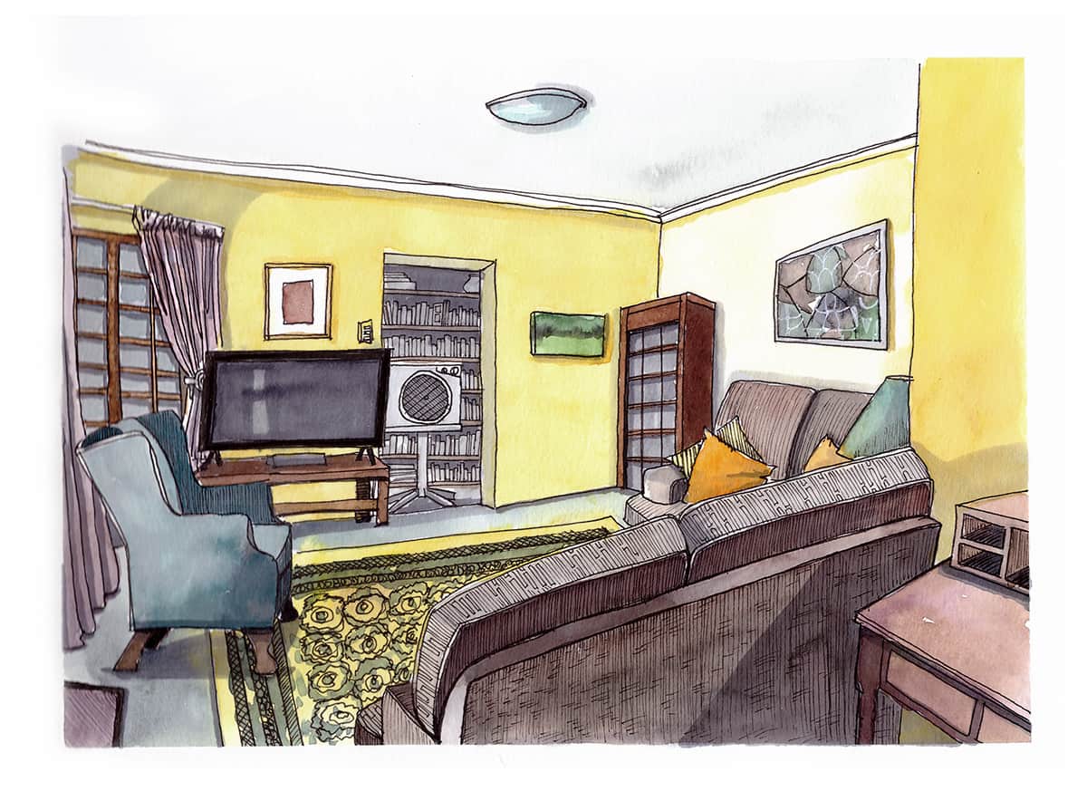
Below is a video of me sketching the living room, trying my best to follow the tips above. The walls are definitely not bright yellow, nor the curtains purple but it’s quite difficult to sketch a room which has such neutral tones, therefore I used some artistic license.
I don’t think I exaggerated with perspective too much but I certainly used Ian Fennelly’s method of not measuring or using any perspective guidelines – I just tried to draw what was in front of me. Adding texture, contrast and shadows were the elements that really helped to make my sketch pop.
Have you used any of the tips above to draw an interior space? Do you have your own tips? If so, I would love to see – tag @urbansketchingworld on Instagram and let me know!
Would you like to get more information, inspiration and advice like this straight to your inbox? Say once a week? Well, look no further! Join my newsletter here and your wish is my command, you’ll even get a free lesson! 🙂